Thanks to Pat for her feedback on Assignment One. Really useful pointers, suggestions and recommendations. All positive, the overriding messages being what you've done is ok but you need to do more of it! More sketching, more sampling and more observing the world.
I'm already working on Assignment Two and plan to take all Pat's suggestions on board, starting with more extensive sampling and setting myself a challenge of doing some sketching every day, even if it's just a little bit.
Onwards and upwards!
Showing posts with label Assignment 1. Show all posts
Showing posts with label Assignment 1. Show all posts
Sunday, 28 October 2012
Tuesday, 11 September 2012
Assignment 1: Reflective Commentary
This first assignment has been a series of bursts of exuberant energy
followed by struggling to get going. Looking at the work I've completed, it was
no surprise to analyse the gaps and find that they were when sketching or
drawing was required. (Um, and rather longer than planned finding the right theme for the blog - oops!).
I think I am developing a little more confidence with picking up a sketchbook and have been doing lots of research on other people's methods for sketchbooks and journalling. I've also found some good resources such as the Sketchbook Challenge for encouragement.
My Pinterest account and Picasa albums are building into a good collection of visual inspiration.
Joining the Textiles Facebook group and engaging with other students via the group is proving a really useful resource - just being able to discuss ideas, plan visits and trips etc. helps to keep me motivated.
In terms of work I have completed so far, highlights have been working with a wide range of materials. In particular, I have (finally) learned that it is both necessary - and possible - to teach oneself to use a new medium (watercolours in my case). This revelation was quite liberating. For some reason I assumed that artists are all naturally proficient in all media when I would never assume that I should instinctively know all textile methods but have to spend time learning them. An interesting statement on my assumptions about fine art and artists. With a bit of luck I'll cut myself a bit more slack and spend more time learning about the media before plunging straight in and expecting to be an instant Da Vinci!
Am I pleased with what I've done? Yes, in the main. I've a long way to go but I'm enjoying the learning progress and pushing myself outside my comfort zone. I'm enjoying the research and collecting, too. I think it will improve my future work.
My approach has always been to go straight into the stitching and do my practising and testing “live”. I am starting to see benefits in taking a step back and putting thoughts, visual images and the like onto paper before I commit to fabric as it is making me think in a more focussed way.
I’m still wrestling with how to structure sketchbooks. I have several on the go at any one time – different sizes and formats – some with themes, others less structured. However, I like to be able to pull images together from different sources so rarely put anything permanently in one place. The bound journal format really doesn’t work for me. Ring binders and photo albums with removable pages have been my preferred choice previously - not as arty or “sexy” but more practical! Online “albums” such as Pinterest are also great for the way I work. I can scan or photograph objects as well as straightforward images and create online, really flexible mood boards. Maybe I’ll need to think about printing off collections as a more physical record?
For the next assignment I’d like to work more with colour and texture, working larger-scale and sketching/journaling more. Onwards and upwards!
Friday, 23 March 2012
Assignment 1: Project Two - Stage Six - using thread and yarns to create textures

For this stage I chose a sketch of a cardoon plant that grows in my in-laws' garden. It is like a huge thistle and reminds me of an old-fashioned shaving brush my grandad used to use.

I decided to focus in on the top of the plant as it has lots of interesting texture with the feathery "bristles" and thick, scale-like outer shell.

I used a range of threads, embroidery floss, wool, crewel wools. I split the embroidery floss and worked with different numbers of strands to create the feathery effects. I interspersed these with crewel wools so that the light-reflective floss stood out, adding additional texture and depth. The thicker wools reflect the tough outer casing and I added plum-coloured floss to show the colour striations in the "scales". For the background I used a dark-coloured hessian fabric to give a rustic feel.

These photographs of the plant show the key features from different angles.


Learning Log
I feel that the stitching has captured the texture in the plant. Although I used simple straight stitches I found that this was appropriate when combined with using different thicknesses and lengths of stitch. I also split the stitches to create additional texture.
The source material worked well, having good colour, shape and texture. An alternative would have been to work with the leaves as these also had good texture.
The sketch is not particularly strong, the pencils did not give particularly rich colour. However, when combined with the compositional photos and given that I was primarily concerned with texture and shape, it gave an acceptable basis to work from.
I enjoyed working with both yarns and stitches to create different textures and I find like both for different reasons depending on the circumstances. Stitch-selection influences the choice of yarn and vice versa. On balance I prefer the use of stitch over yarn as there is greater flexibility and it requires fewer resources!
For example, I have found that a very wide range of textures and stitches can be created with embroidery floss and crewel wool. This is due to the fineness of the thread allowing texture to be built up and many colours can be created by combining fine threads of different colours. Thicker threads can also be made by using several strands at once. This is a good method for subtle shading as in this example using embroidery floss.

Whilst yarns can be a great choice for texture, it is necessary to have a much more wide-ranging stock of source materials. Furthermore, for some textures, thick yarns require heavier fabrics to support the weight as was evident from this sample and my whirlpool galaxy piece.

Project scale also influences the relative importance of stitch vs yarns. For small-scale projects finer threads give greater flexibility. For large-scale projects there is much more scope to explore different yarns and threads and incorporate highly-textured and varied yarns, as well as other handmade "yarns" from fabric strips, plastic etc. These are more difficult to use on a small scale.
In terms of techniques I have barely scratched the surface! I have put together a small travel pack of threads and fabrics so I can practice stitching-on-the-go. I think it will help me to overcome my discomfort with drawing if I can intersperse it with stitch-sketching, starting with the stitch, taking a photo and finishing the stitching later if I don't finish whilst directly observing the source. (I will still be doing more traditional sketching, too!). I've also purchased some seondhand stitch dictionaries for more formal practice. I plan to carry on with my machine-stitch samplers on the Bernina.
A common theme so far is in relation to size. I tend to work on a small scale or lifesize. I'd like to do some larger-scale work as I think it might encourage me to interpret images more freely and less literally.
Friday, 16 March 2012
Assignment 1: Project Two - Developing your marks - Stages 4/5 - Stitches which create texture

For this exercise I chose a range of yarns in the same colour family but with different thicknesses and texture. I also looked for differences in light reflectivity. My selection included thick cotton chenille thread, couched onto the fabric,

couched shiny viscose thread with stitched finer threads, crewel and floss,

embroidery flosses using variations of a simple straight stitch,

crewel wools and floss and dense, close stitching in satin stitch

and sparkly metallic threads with floss and crewel wool. In this sample I worked by weaving the metallic thread across a "frame" of floss to create a web-like effect.

Here I've used chain stitch and a combination of floss, viscose and crewel wool, using different stitch sizes and stitching closer together/further apart to create different densities on the fabric.
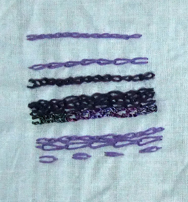
I can see potential uses for most of these samples; couching the viscose is useful to preserve the shine. It is thick, too, so it prevents damage to the fabric if it is laid on top. Nice curves can be achieved this way and good layering effects.
The simple straight stitch creates a lovely starburst effect just by varying the number and length of stitches that form the "legs" of the star.
Satin stitch is great for dense coverage and neat curves. The dullness of the wool is in contrast with the reflections in the floss.
The webbing was fun and made good use of the sparkle by allowing it to be concentrated in one area but allowing the background to show through. There was more sparkle and less waste by keeping the all of the thread on the front of the work. Again, this could be used for layering to add highlights.
The chain stitch would be useful for landscapes. It reminds me of paths, drystone walls, stones and walkways.
Thursday, 15 March 2012
Assignment 1: Project Two - Developing Your Marks - Stage 3 - A Sample


For this project I selected one of the images from an earlier exercise, the whirpool galaxy. It appealed to me because of the strong spiral shape, the interesting colours and the way the shape stands out from the dark background.

I began collecting my selection of yarns and threads and chose a combination of sparkly threads, embroidery floss and, for the main spiral, a rather bright shiny synthetic novelty yarn. The variegated shading, the sheen and the feathery nature of the novelty yarn nicely reflected what I wanted to recreate with my sample. I worked on a dark background to simulate the dark universe and to let the galaxy really stand out.


I quite like this piece. It would be fun to repeat the exercise on a larger scale, using fine threads to add featheriness and show the finer "veins" of the galaxy. A crushed velvet would be interesting to give an impression of depth but with light/shade as an alternative to the rich, but duller, non-reflective wool.
Tuesday, 13 March 2012
Assignment 1: Project Two - Developing your marks - Stages 1 and 2 - Exploring marks and lines through stitch techniques
I've picked a basic straight stitch for this exercise and have used a variety of different threads and yarns, including embroidery floss, wool, viscose and hand-dyed stranded embroidery cotton, all in shades of greens.
 I have also dusted off the trusty Bernina (a 1090 for any Bernina
buffs out there) and started working my way through all the different
stitches and stitch combinations. I also (deep breath) read the
instruction manual. This alone has been a revelation! Although I've used
it quite a bit it only really sees the light of day for the usual
household jobs like hemming, patching and (very occasionally) a bit of
home-sewing - cushions and the like. (Good job I know the DH doesn't
read my blog given how much it cost - oops).
I have also dusted off the trusty Bernina (a 1090 for any Bernina
buffs out there) and started working my way through all the different
stitches and stitch combinations. I also (deep breath) read the
instruction manual. This alone has been a revelation! Although I've used
it quite a bit it only really sees the light of day for the usual
household jobs like hemming, patching and (very occasionally) a bit of
home-sewing - cushions and the like. (Good job I know the DH doesn't
read my blog given how much it cost - oops).


I'm amazed by how much it can do that I never realized so this is going to be a great exercise. So far I'm up to stitch 4 of 28. It isn't a swanky computerised affair but has 14 decorative stitches as well as all the normal ones so I've lots still to play with. And the normal stitches are proving interesting in themselves. I'm planning to build my swatches into a nice reference collection so they'll be useful after the course too.


I'm amazed by how much it can do that I never realized so this is going to be a great exercise. So far I'm up to stitch 4 of 28. It isn't a swanky computerised affair but has 14 decorative stitches as well as all the normal ones so I've lots still to play with. And the normal stitches are proving interesting in themselves. I'm planning to build my swatches into a nice reference collection so they'll be useful after the course too.

Sunday, 11 March 2012
Assignment 1: Project One Learning Log
This has been an interesting series of exercises. My experience of drawing has been more focussed on accurately representing whatever I am drawing/painting so working with just words as the inspiration was quite liberating. There was no "right" or "wrong" or feeling of having failed to draw something realistically. I feel that my use of different marks was initially quite limited but expanded as the exercises progressed.
I found a surprising range of media to work with and enjoyed working with all of them.
With most of the exercises I found at least one example that I was pleased with. It was interesting that by putting the samples to one side and re-visiting them later I found them more satisfactory after a short break! This has definitely made me more confident.
The most satisfying exercise was Stage 3, interpreting the textures using different media. Overall my favourite pieces were the nebula and the coral. I think this was bacause I matched the media well to the images to capture the textures and created several interpretations that I could see translating into a textile-based project.
My favourite media was probably the aquarelle pencils for versatility. The watercolours were a surprise pleasure as I haven't been very successful with using watercolours previously (I did invest in a book about how to use watercolours so this probably helped!). The pastels were lovely for richness of colour but I need more practice controlling them!
I think there is more scope to explore printing, rubbings and uisng combinations of different media.
Friday, 24 February 2012
Assignment 1: Project One Stage 4 - Working from your Sketchbooks - Exercise 1
For this exercise I chose four images, two from sketches, two from earlier projects. I decided to have another try at the bogwood, this time using a wax resist technique and trying an intentionally unrealistic colour scheme (using a rainbow of colours).
I selected the shape of the galaxy from earlier in the project, this time working with printed "teabag" papers, cut into small triangles, to interpret the spiralling shape.
Image three was an interpretation of body art from my sketchbooks. It is based on henna tattoos, interpreted using paint and glitter.
The final piece was also from my sketchbooks, a simple shell. The shell had a lovely ridged texture and I chose to capture this in paint.

I don't particularly like any of these interpretations. It was useful to try the wax resist using different colours as I'd considered earlier, but the medium didn't really allow for sufficient detail to capture the woody texture.
The spiral is ok but not particularly inspiring. Likewise the tattoo intepretation is ok but not really texturally expressive.
Of the four, the shell is the best option as the paint allows the light and shade to bring out the textural qualities of the shell.
I may repeat this exercise at some point using different subjects to see how this affects the results.
Assignment 1: Project One Using Marks to Create Surface Textures Stage 3 - Exercise 2
For this exercise I chose three items: A woven basket, a piece of bogwood and a piece of coral. I drew each using a variety of media.
These were my results...

I found that the woven texture of the basket was particularly difficult to capture convincingly - I used Letraset Promarkers, Aquarelle watercolour pencils (and a rubbing with crayon that has gone missing!). I struggled with this one.
The bogwood was also quite tricky. I used pencil, watercolour and a combination of gouache applied with a decorating brush and wax crayon rubbing. Of the three, I like the appearance of the gouache/wax. The rough bristles of the decorating brush came the closest to the texture I was looking for and the colours are the best of the three examples.
Surprisingly the coral was the most interesting and satisfying texture to interpret, despite the piece being almost completely white. Perhaps this meant I had to focus on texture without being distracted by colour. I worked in fineliner pen, a 6H pencil and, to see how a less precise media would work, pastel washed with watercolour. Of thes, I like the pen best because of the intensity of the texture but I think each could be interpreted nicely in stitchwork.
And here are photos of the pieces:
Thursday, 23 February 2012
Assignment 1: Project One Using Marks to Create Surface Textures Stage 3 - Exercise 1
Exploring surface textures.
For this exercise I chose two images and used four different combinations of media to reflect the textures in the images.
The first was an image of a rice field from the Guardian and I chose (from left to right):

The second image was of a star galaxy from an amazing book about astronomy. For this I chose:
Overprinting with the cork has brought out the appearance of the gases surrounding the nebula in the first interpretation. However, my favourite is the pastel version as the smudgy nature of the pastels blends the colors to give the impression of swirling gases, but has more depth and intensity.
And the original images?
The full image..

And my selection...
 Whirlpool Galaxy...
And my selection....
For this exercise I chose two images and used four different combinations of media to reflect the textures in the images.
The first was an image of a rice field from the Guardian and I chose (from left to right):
- Watercolor paint wash and letraset marker pens to pick out the finer detail of the rice plants in the paddy fields.
- Oil pastels.
- Coloured pencils.
- Aquarelle watercolour pencils used both as watercolours and as pencils for the finer details.

The second image was of a star galaxy from an amazing book about astronomy. For this I chose:
- Acrylic gouache paint overprinted with lustre paint applied by dipping and printing with a bottle cork.
- Watercolour paint accented with natural food colour.
- Oil pastels.
- Coloured pencils.
Overprinting with the cork has brought out the appearance of the gases surrounding the nebula in the first interpretation. However, my favourite is the pastel version as the smudgy nature of the pastels blends the colors to give the impression of swirling gases, but has more depth and intensity.
And the original images?
The full image..
And my selection...

And my selection....
Assignment 1: Project One Making Marks - Stage One/Two - Exercise 4
Another stash-dive for fun media and trying some new techniques...
Here I've experimented with wax crayon, acrylic paint, oil pastels, pencils and watercolour paints.
I've tried a range of techniques: Rubbings with crayon, wax resist with watercolour, using an eraser to create patterns by removing areas of pencil, scratch-patterns with a craft knife over pastels and wet acrylic paint, printing with sponge and acrylic paint and printing with a piece of waste plastic and acrylic paint.

Using the eraser on the tonal pencil was more effective than I expected. This could be varied further with sharpened or shaped erasers and a range of different patterns. The wax resist was interesting as the paint left speckles on the crayon in addition to being resisted by the wax. Using a wider range of colour under the paint would be fun to try.
Assignment 1: Project One Making Marks Stage One/Two - Exercise 3
Extending exercise 1 by working with different media and techniques...
Coloured pencils, felt pens, watercolour wash, lustre paints applied with a cork, watercolour pencils.

Bubble wrap, tissue paper, gold paint, inks and paints. I used the inner part of the template to create the outline on the red tissue paper with gold paint. I cut the bubble wrap with a craft knife and coloured over it with pens. The pen sank deeper into the paper backing in the cut areas creating the darker orange lines. It seemed a shame to waste the outer part of the template so I coloured it with more pen.

Here I chose a different background but used the same template shape. I experimented with chalk, oil pastel and gold paint, working both using the inner and outer part of the template. I like the interaction of the dark background with the metallic paint and the bright white of the pastels. The use of sharp lines of pastel and chalk give strong, lively shapes.

More bubble wrap! This time painting onto the bubble wrap and using it to print with onto tissue paper. Also sponging inside and over the template shape with acrylics. Bottom left is a watercolour sample, with the colour dropped inside the template shape.

I dug deep into my stationery stash for these and found lots of interesting colours, shapes and media to play with. The first and third pages work best for me, although the red/orange combinations are interesting. The colours in the final page don't work for me at all!
Assignment 1: Project One Making Marks Stage One/Two - Exercise 2
More work with a variety of pencils within a stencil shape...
 Three different areas of tone within each stencilled shape, dark, mid-tone and light.
It was interesting using the pencils at different angles to achieve effects from fine lines through to broad swathes of pencil.

It was interesting using the pencils at different angles to achieve effects from fine lines through to broad swathes of pencil.
Assignment 1: Project One Making Marks Stage One/Two - Exercise 1
Using marks to express words:


For this exercise I used a range of pencils, from hard 6H to soft 6B, working with the pencils at different angles to achieve sharp lines, soft lines, smudged areas and shapes.
I'm sure this should have been simple but I found it surprisingly difficult to achieve lots of variation. Some words were easier than others: Sharp, hard and sad are, I think, my favourites.
Subscribe to:
Posts (Atom)