Thursday 19 December 2013

Assignment 4 - Action Points and Thoughts From Tutor Feedback

The tutor feedback has been very useful, in some cases confirming issues I had already identified such as the weight of the warp and the need to sample more carefully, but also in suggesting ways in which issues arising from some of the pieces could be avoided or resolved. For example the use of thinner strips of materials and plastics would allow me still to use material but in a way that is more effective.

Project 8: Exploring structures
Weaves:
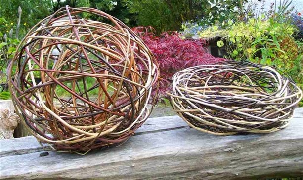
I struggled with creating alternative weave structures and the tutor has made some excellent suggestions. Having done some research, I have a clearer picture of what was being asked for in this exercise and have found some useful suggestions for future projects. In particular, I have been looking at willow weaving, weaving in floral arrangements and woven wire structures that I may revisit.


Braids and ropes:
I enjoyed creating the braids and ropes and, having read the tutor's suggestions and seen some of the amazing wire work of Walter Oltmann (see above) I am very keen to explore wire as a means of creating fabrics and 3-dimensional sculptural pieces.

Project 9: Woven Structures
Weavettes and God's eyes
Having used the small carboard looms to produce quick samples it would have been sensible to repeat this for the larger samples. A useful point to consider for future projects.

Mexican God's eyes are very pretty. It would be fun to do more of these with different materials and to explore different sizes.

Woven samples
Very valid points raised by the tutor and some of the points raised I have identified however the tutor has offered some very useful ideas on how to resolve (and prevent) these issues.

Project 9: Experimenting with different materials
Bleak piece
The tutor has offered some useful food for thought on interpreting images into weave. I can see that there is significant potential to go beyond simply interpreting colours and textures but also to think about shapes and how a whole image can be used as the basis for a weave not just a selected element of it.

Autumn piece 1
The tutor's comments came as no surprise and I agree wholeheartedly with the observations made. I need to sample more carefully and consider the warp as much as the weft! With more experience and practice I will hopefully be able to predict more accurately what will happen to a weave once it is removed from the loom and avoid this issue by addressing the suitability of the warp for the materials, the weight and density of the materials and their arrangement in the piece. More sampling would have been useful here and is a lesson learned.

Autumn piece 2
Having been determined to crack the open warp problem I thought I had handled this better in this piece by stiffening the warp with starch and pva. However, there was still the issue of the bottom-heaviness of the piece. I am finding it difficult to translate from the wrap to the weave but should have picked up this issue earlier on in the process and changed tack. This is something I need to work on and if something isn't working, go back to the drawing board and re-think before continuing.

Saturday 30 November 2013

Assignment 4 - Understanding the Textile World - Art, Craft or Design?

How do you view textile art? Do you think about it in the same way that you would look at a painting or sculpture? 

I believe that textile art can be art, design, craft or a combination of these. I posed this question on a forum and found discussions that had been running for over 5 years, which, if nothing else, is indicative of how difficult and subjective these distinctions are!

Craft
Craft for me is perhaps the broadest as I think it can include works that are simply produced by someone according to a pre-determined pattern or format or where there is limited unique creative input from the craftsperson. A sweater knitted to a pattern or a tapestry stitched following a chart would be craft as it involves skill and making, but as it doesn’t involve individualistic elements, for me it would not be design.

Design
Design, on the other hand, can incorporate a very broad spectrum of textile arts. It can include both functional and non-functional pieces. It could be a project that is intended to be used for incorporation into another item or for replication for mass-production. The pattern for a sweater to be knitted by someone else falls within the category design as would a sketch or sample that was to be commercially reproduced as a printed fabric. The design for a one-off dress might be reproduced for the high street. Design for me involves personal input and uniqueness of the design even if it is to be later reproduced.

Art
Art to me implies a piece that has no intended functionality other than to give pleasure to the person experiencing it. A textile that is to be appreciated by being hung in a gallery or exhibition is art – beautiful but without the constraints of functionality or practicality. Textile art can be more adventurous and experimental as it does not have to meet the requirements of a practical textile. 

Durability, longevity, comfort, washability and care are limitations required by design that are not imposed on the artist to the same extent. To take my weaving samples as an example, the use of non-conventional materials such as straws, bubble wrap and plastic would have been acceptable in a woven wallhanging but not a rug, furnishing fabric or garment fabric. For a woven fabric that was to have a purpose, careful thought would need to be given to a range of additional aspects – drape, strength, colourfastness, robustness and care for example.

That is not to say that any one aspect is mutually exclusive. The sketch or drawing from which a printed fabric is produced could, for example, be art. A garment produced purely for a fashion show that will only showcase the skills of the designer, may be considered both art and design.  A painting that is later turned into a print or printed onto mugs, towels, t-shirts and other items remains art as it had no such purpose when it was painted. Any subsequent translation of a painting into a mass produced souvenir doesn’t necessarily alter its essential characteristics.

Ultimately, I would consider the intention of the artist/maker/designer to be the defining factor. It is for them to decide how they see themselves.

How far do you feel it has been accepted as media for fine art by the fine art establishment?

With regard to how textile art is viewed by the fine art establishment, I feel that it is becoming more appreciated and is receiving more interest from the fine art world. Textile art is popular as installation art in buildings, perhaps because its 3-dimensionality has the capacity to fill a space and create an impact from a distance in a way that wall-hung fine art can’t.

However, as with antiques and art in general, in pure financial terms, textile art will only ever be worth what a buyer is prepared to pay. Consider an original Banksy – (financially) valueless and to some an ugly abomination that serves only to deface public property, these works now command high prices as it is fashionable to own one. Recently a number of Banksy’s (complete with original wall and plaster) have appeared at auction for sums up to £1m.

I feel that textile art still has some way to go to achieve the heady heights of some fine art. Perhaps the acid test would be to ask the man on the street to name a textile artist and a fine artist. I cannot say for certain, but suspect that most will have little trouble naming a fine artist but fewer people will be able to name a successful textile artist. However, textile art is becoming more available and more collectable and this can only be beneficial to textile artists everywhere.

Sunday 24 November 2013

Assignment 4 - Understanding the Textile World - Inspiring Textile Artists - Kaffe Fassett and Jason Collingwood

Kaffe Fassett

My first choice of inspirational textile artist was an absolute no-brainer. Kaffe Fassett was the first textile artist I can remember and his impact was both instantaneous and enduring.

Fassett the Knitting Designer

When his first book, Glorious Knitting, was published in the UK in 1985, for me it heralded an explosion of colour and innovation in my knitting world. I'd been a knitter since I was 7 and knitting seemed to me to have changed little in the intervening 10 years. The first thing that struck me then, and continues to inspire me today, is the totally immersive use of colour. In theory, such unbridled use of colour should not work, but it absolutely does. Somehow Fassett creates a cohesive whole from what, in the hands of someone less talented, would look like a cacophony of jarring, clashing hues.

What Fassett also brought to the knitting world, based perhaps on his fine art upbringing, was a clear use of sketchbooks and design development from the art world. The photography was art in itself and a far cry from the rather utilitarian photography being used by the many pattern and yarn companies. Compare, for example, Steve Lovi's funky photography...

with the more usual pattern photography of its day...
 (NB. There were exceptions of course but these would be familiar in most knitters' pattern collections!).

 Also of note was the source of inspiration for the designs and the clear link between the source and the finished design. Fassett was drawing on sources that were pretty much unique in the knitting world. Not to diminish the talent of designers but there was little evidence of how a design came into being and designs seemed to be much more formulaic and a direct interpretation of high street fashion, traditional or tried and tested designs. This was probably largely indicative of the transition of knitting from practical, functional garments that would be less expensive to make than to buy and garments that were intended to be made for pleasure and fashion.


The Tapestries
Not content with knitting, Fassett also has an impressive portfolio of tapestry work. Ranging in size from smaller pieces such as cushion covers, in traditional square and rectangular shapes, not surprisingly Fassett takes the medium to new levels with complex shaped pieces, rugs, wallhangings, upholstery and even shoes! The imagery is equally wide-ranging - pottery, plants and animals, architecture and collected objects.


Patchwork
Patchwork was, one assumes, a natural progression for anyone with such a passion for shape and colour. However, reading his autobiography (Dreaming in Colour), Fassett took a bit of persuading to take this on! And it's to our benefit that he did, since his patchwork pieces are a delight.


Fabric Collections
Fassett has also designed fabrics for Rowan and under his own label. What surprised me was that he had doubts about his ability to produce fabric designs and it took a gentle push from Trisha Guild to persuade him to take on this new aspect of textile art (Dreaming in Colour pg 117). What is interesting but not surprising is that the approach was founded in fine art first and foremost. These are a couple of examples of artwork for fabrics.

Cabbage Patch


How amazing is the array of colours for this one design?

Peony


I felt very privileged to see these - it is clear that they are geniune working documents and an amazing insight into the design process. This particularly caught my eye!

A selection of Kaffe Fassett fabrics and ribbon.


As to whether Fassett is a designer or an artist, in his autobiography he draws a distinction between the two (Dreaming in Colour pg 126). Clearly he sees some of his work as art, other parts as design. Whilst not expressing his reason for this distinction explicitly, he goes on to discuss his painting and fine art as being his return to his artwork. From that might one infer that he regards his textile work as design and his painting as art? I think that would be for him to conclude and not me!

Jason Collingwood
For my second designer I have chosen British weaver, Jason Collingwood. Rather than make this a super-lengthy post, I have covered his work here This post was based on a talk and exhibition of Jason's work from the Open Day organised by the North Cheshire Guild of Spinners, Weavers & Dyers that I was lucky enough to attend.


Saturday 23 November 2013

Assignment 4 - Project 9 - Reflective Journal - What Have You Achieved?

Did you have enough variety in your collection of yarns and other materials? Which kind of yarns etc. did you use most? How do their characteristics affect the look and feel of each sample?
I found a good selection of yarns and materials in terms of colour and texture. Some of the yarns were rather fine so working with several strands was needed in some areas. It would have been useful to have a wider selection of thicker yarns. I used yarns the most, largely because these produce excellent warp coverage, offer a good range of textures and are easy to manipulate. The thicker (or multiple-stranded) yarns create a firmer, more dense fabric which would be well suited to sturdier projects such as rugs. They are also quick to work, filling up the warp at quite a rate.

Finer yarns are much slower to work with (more wefts needed to cover an inch of warp). The advantage, however, is that they offer more scope for subtle colour changes. Curved wefts and patterning can be quite delicate and detailed. If working to an image, it would be possible to produce much finer detail.  Being able to combine finer threads means subtle texture can also be incorporated, for example, a fine boucle thread with one or more smooth wool yarns, or a metallic with plain yarns.

How did you find weaving in comparison to the other techniques you have tried? Did you find it slow or too limiting?
Despite the intial setbacks with warping, I actually found the second warp surprisingly satisfying, particularly as I knew I should be able to make several pieces from one warp. Weaving lends itself well to my yarn collection which has lots of interesting textural yarns, handspun and hand-dyed yarns that aren't readily incorporated into stitching, other than via embellishment. These yarns suit the scale of weaving better.

Clearly there are limitations with weaving, imposed by, for example, the size of the loom. However, with careful planning I think there is considerable scope for developing exciting pieces using this medium.

How do you feel about your finished sample? Are you happy with the relationship of the textures, proportions, colour and pattern to the finished size? Is there any part that you would want to change? If so, try to identify exactly how and why you would change it.
I like the intensity and variety of colour in the piece. I think overall the piece captures the combination of warmth and earthiness of autumn. The textural qualities of the materials have worked in the main. However, if I were to repeat the piece I would look to lighten the bottom of the weave and almost certainly re-think the braids which are out of balance with the rest of the piece.

 Was there any stage in the whole design process, such as choice of source material, deciding proportions, choice of yarn or colour, translating idea to sample, that you felt went wrong? Would you tackle this process differently another time?
Additional sampling, in particular, considering the impact of weight and thickness of the non-yarn based materials (the fleece and roving) would have benefitted the finished sample.

Which did you enjoy more - working from the source material or putting colours together intuitively? Why?
As weaving has to be carefully planned, whether working intuitively or from a pre-determined source, there is arguably less scope for spontaneity than with other techniques. I enjoyed the structure and discipline of working to a specific source and this gave a certain reassurance that the piece would turn out according to plan. Working intuitively, on the other hand, was more challenging as it required regular review of the work and there was more risk of areas that didn't work. Given the scale of the pieces this wasn't a particular issue but I would sample first if I was working on a larger or finer piece. I would like to experiment with working from a cartoon, replicating a specific image.

Friday 22 November 2013

Assignment 4 - Project 9 - Woven Structures - Stage 4 - Part Two - Developing Design Ideas into Weaving

(DISPLAY BOARD PIECE - BOARD 7 OF 10)

For this sample, inspired by the pleasing rustic appeal of the Mexican god's eyes, I chose natural materials for the frame, a piece of dried twig and a small dowel. I wanted to explore the relationship between the warp and the weft, playing with the interaction between the two. In my mind was the idea that in some weave structures the warp is the dominant force (warp-faced weaves such as ikat) whereas others have a dominant weft structure (weft-faced weaves). I was curious to explore not only the warp and weft-faced weave structure but also what happens if the warp is entirely exposed.

I realised that this would create a potential weakness in the weave but as it was for a decorative sample I did some research and discovered that it is possible to paint the exposed warp with dilute pva or starch to stiffen and strengthen it.

As I wanted some exposed warp sections, I chose an interesting-textured boucle yarn which was fine but strong.

I also wanted to experiment with different materials in the weft. I wanted to see how far I could push the open weave structure before it failed to work. I drew inspiration from the earlier braids exercise and selected a range of hand-dyed and commercial, textured threads - wool, raw silk, cotton and viscose. I included some hand-dyed, handspun wool yarn but also bulkier materials - hand-dyed fleece, roving and even as thick as braids. For the dyeing I used natural dyes - I used goldenrod overdyed with woad for the greens, coreopsis, goldenrod for oranges and yellows and iron-modified cutch for the lighter browns. The darker browns were naturally-coloured fleece/wool. I also incorporated a small amount of commercially-dyed yarn in the braids.

Design inspiration
The inspiration for the piece itself was piles of richly-coloured autumn leaves, laying on the ground in a dense forest, with moss and lichen visible through the piles of leaves as they crumble and decay. In the open areas the leaves have disappeared, returning to the soil to nourish the forest. Rich grey and brown handspun yarn represents the deep, rich humus and gnarly roots poking through the leaves. The lichen and moss are growing around the base, thriving in the cool dampness beneath the forest canopy.

Design process
I used starch paste to stiffen the boucle thread to make a very simple warp.

Onto this I wove a range of materials, fibre, fleece, yarn, string. I left parts of the warp completely unworked, some lightly packed to allow the warp to remain partially visible whilst other areas were densely filled and woven over. With the fleece, I left tufts at the front, anchoring them into some strong rug yarn.


I drew on the earlier exercise (3) to make a number of twisted and braided cords which I attached to the bottom of the piece.


I completed the piece by applying additional dilute pva to prevent movement in the open warp sections.

Thoughts
I like the textural qualities of this piece and the natural forms. The warp is somewhat light for the weight of some of the weft materials but I like the concept of exposed areas - as well as reflecting the original design, it gives an impression of an old piece that has seen many years of wear and is itself in the process of slow decline. The use of natural dyes for the hand-dyeing added to the natural qualities. When I was working the piece it also had an earthy smell which added to the making experience. It would be interesting if this smell remains - it would add an extra dimension to experiencing the piece. (note to self: wonder if this could be used more widely - fragrance-infused pieces to evoke emotions/images?)

If I were to repeat this piece I might use a thicker warp, but  still with texture. I would also lose some of the braiding - it proved a little excessive!

Tuesday 19 November 2013

Assignment 4 - Project 9 - Woven Structures - Stage 4 - Part One - Developing Design Ideas into Weaving

Given the time of year it's no surprise that for this project I was inspired by the theme of Autumn. I gathered a selection of images, my own photos, an envelope for a gift card, sourced images and assembled these into two mood boards.


I used the mood boards as a basis to collect together a range of materials that to me were expressions of autumn, either in terms of colour, texture, or both. This included slubby natural and synthetic yarns, handspun, hand-dyed yarn and fibres, twine, hessian fabric, fabric ribbon remnants, leftover "pipes" from the Steampunk book cover in project 7.


For this piece I chose to work intuitively in interpreting the mood boards, selecting materials in a way that felt satisfying and interesting. I began with plain weave using a variegated mohair boucle for damp undergrowth, added a raw silk in bright orange as autumnal falling leaves mulching into the soil, then returned to the brown boucle. I cut short lengths of hemp yarn and randomly added these to the weave using Ghiordes Knots to create a feeling of dry twigs. I've left these long and looped but may cut them at some point later once I've had the chance to let the piece settle.

I used a range of textured yarns, ribbon and hand-dyed yarn to create a deep pile of fallen autumn leaves, ripe for kicking up while out walking on a crisp autumn day! 

I incorporated two "branches" of fabric-wrapped straws (left over from the Steampunk cover). Handspun boucle yarn and a hand-dyed tussah silk were used to create leaves and I left open warp around them to give the impression that the leaves were still falling from the tree. To stabilise the warps I completed the piece with bands of orange silk and brown mohair.

I cut the piece off the warp and tied the warp (hemp yarn) in knotted pairs.


Thoughts:
This piece looked promising when on the loom but when taken off, it quickly became clear that the open warps were far too flimsy and the weaving has lost all structure which is a shame as I like the shapes, textures and tonal qualities. The "pipes" haven't really worked at all, being too rigid and difficult to anchor in place.

Actions: 
I think it would be worth revisiting this piece, taking into account the issues encountered above, using a different warp or lighter materials. On reflection this piece has the feeling of an immoveable force meeting an irresistible object. I was simply too stubborn to recognise what wasn't working and failed completely to predict what would happen when the piece came off the loom. Clearly this is an important learning exercise and as a novice weaver, I have much to learn!

(Note to self: Would it be possible to rescue the piece by mounting onto fabric, possibly a dyed pre-felt, stitching into it to add strength? Or re-stretching and stiffening the warp or even re-mounting on a pin-board and filling in the gaps?)