Tuesday 30 April 2013

Assignment 2 - Action points and thoughts from tutor feedback

The tutor comments were, I feel, a fair reflection of the content of the assignment. I would highlight the following specific areas:

Project 3

Emotional response to colour
In particular I was interested to read the explanation of the reason for exploring the emotional response to colour and mark making. I am aware that there is both scientific and much anecdotal research to support the link between colour and how it influences emotions and reactions (hospitals were often painted green as this was considered to be a calming colour, for example). Red is often associated with sexuality but also with danger. This article in Psychology Today offers an interesting analysis of this concept. With this in mind, I can see how the use of colour in my work could be exploited both to express my own emotional response and also to invoke a particular response in those who may see my work.

Use of different threads/weights of thread in stitched samples
This was something of a surprise as the samples in stage 5 used a number of different materials - ribbon, wool, embroidery thread, lurex thread, viscose twist thread. However, it would be interesting to repeat this exercise with a range of hand-dyed threads/materials dyed in the same bath.
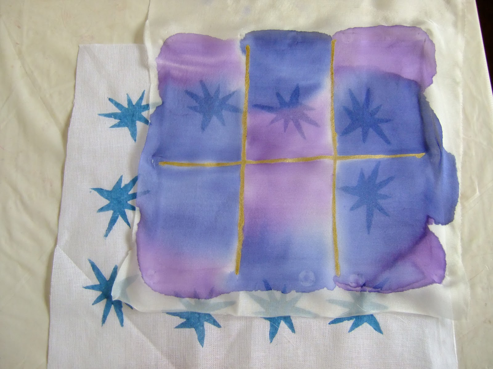
Poppy seed head
I felt that this design started well but did lose its way and I agree that the finished design is a little flat. However, I did use exactly the threads in the wrap so I am puzzled that the tutor thought I did not. Perhaps the wraps were not large enough to see the individual sections.

Project 4
I did find that image manipulation in photoshop was a very interesting, quick way of testing techniques and exploring patterns, orientation, combinations, re-colouring and filtering. I agree with the tutor's comments that some of the designs, whilst very attractive in photoshop, would be very difficult if not impossible to replicate in a textile medium. I think this could be good practice for me in simplifying and focussing on the important aspects of an image, really honing in on the important parts and removing the distracting elements. There can be, too, a sterility in computer-generated design. This may be in part due to my lack of technical expertise but there is necessarily a flatness and lack of textural quality in an image. There is no opportunity for exploiting surface texture for light reflection and shadow or, of course, encouraging people to engage in other ways such as by touch, feel etc.Touch is such an important part of the textile experience for me.

The printing was lots of fun and I have since done lots more printing using a gelli plate, screen prints, lino cuts and simple foam prints. I am also exploring different print media - acrylics, thickened dyes, print resists (wax, starch pastes etc.) and different substrates as can be seen in project 5 and 6.

Project 5
It was difficult to choose my favourite piece from this project and I took the cautious option, choosing the print which was technically the most successful. However, the tutor raises some very interesting points about the other prints, in particular the interaction between the printing and the background which is something I'll be factoring into future projects. I too liked the typographical prints as I find fonts can be turned into many different shapes and forms.

Pointers for the next assignment
Following discussion with my tutor I understand her concerns and have decided to revise my theme book topic to the ocean. At this stage I haven't narrowed my theme down further than that as I want to explore the wider theme and see where it takes me, bearing in mind the work done so far for other assignments and how this could build into the final assignment piece.


My personal targets in light of the tutor feedback
For the next assignment I am setting myself a target to continue to explore emotional responses to my environment, imagery and colours and to reflect this more in my work. I plan to continue my experiments with printing and to explore how printing could be combined with stitching. I have a number of ideas for using quilting, applique and free-machine embroidery to further develop prints into three-dimensional textile projects.

I will be making a concerted effort to gather research material, sketches etc. for my theme book and to consolidate this into a strong theme for my final project.


Thursday 18 April 2013

Assignment 2 - Project 5 - Reflective Journal

Do you feel you made a good selection from your drawings to use as a source material for your design ideas? Which interpretations worked best? Why?
I am pleased with the typography and the airplant as source images. The typography in particular offered many different opportunities for development and re-interpretation. The airplant was not quite as versatile but nonetheless offered scope for using different materials, re-sizing and arranging in either structured or random patterns.

The basketweave wasn't as interesting as I had hoped although I did feel that the shibori-style clamped and dyed piece was an unexpected success. The bleached version was rather disappointing - not sure whether this was the fabric or whether I needed a stronger bleach (maybe a specific discharge chemical?).

The "drip" was, I think, too unstructured. Having said that the image manipulations and negative colour imaging was very interesting. I think it might be possible to simplify this image and work into the simplified version, playing more with colour and media. Using the silk for these pieces was a good way to exploit the drippy nature of the image but I would need to do more experimentation to solve the challenges posed by getting the balance of too much/too little dripping and blending right.

In terms of interepretations, the success of the interpretation depended on the optimum combination of technique, medium and fabric. Some techniques (the potato printing for example) worked very well on smooth fabrics with thickened dye but was of limited success with the resist paste. The stencils on the other hand worked very well with both the typography and the star-flower both with the resist paste and with thickened dyes. Overall, the interpretation that I feel worked best was the final sample as I chose my favourite combination for the typography, moving it away from the original but still with echoes of the source image. I like the crispness afforded by the stencils, thickened dye and resist. I would like to re-work this piece in different colours, perhaps in an octagonal shape to mimic a kaleidoscopic effect. Whilst the colours in the final piece work, I have concluded that yellow isn't my preferred colour!

Which fabrics did you choose? What particular qualities appealed to you? 
I chose a range of fabrics to give different surfaces, drape, some colour and both synthetic and natural fibres. I also selected fabrics with different densities, from the heavy hessian to the fine voile. I wanted to see how the fabric affected the design and how fabric and design need to work in harmony to achieve a successful result.

Is the scale of marks and shapes on your samples appropriate to the fabric? Would any of your ideas work better on a different type of fabric? Why?
For most of my samples I made the tools (stencils etc.) to a scale appropriate to the fabric size. However, as I have noted elsewhere, a number of the experiments could be scaled up for use on larger fabrics, for example, furnishing or homewares as opposed to apparel. The spray-stencilled typography (made with the modelling clay) wasn't used at the fabric stage but this would make an excellent large-scale motif or centrepiece.

Certain of the samples could be repeated on different fabric types. The stencils could be sprayed with fabric paint onto silk or a sheer fabric. Handpaints could also be used on a stretched silk/voile or a gutta outline used and the shapes filled with silk paint. The basketweave could be cut into a lino block, possibly with two different blocks that can be printed on top of one another to mimic the weave effect. Stamps would work well on the hessian although it would need to be a paler colour to make the paints visible!

Do the marks and shapes seem well-placed, too crowded or too far apart? Were you aware of the negative shapes that were forming in between the positive shapes? 
In some cases the patterning was a bit dense (the purple natural-dyed typography sample for example). I'm not sure to what extent I was exploiting the negative spaces in the fabric pieces. Probably not very much! I did, however, look quite consciously at negative spaces when manipulating the images on the computer.

What elements are contrasting and what elements are harmonising in each sample?  Is there a balance between the two that produces an interesting tension?
As mentioned in the notes accompanying the images, the negative image of the typography created with the modelling clay contrasts a geometric, balanced pattern with a subtly changing print. 

How successful do you think your larger sample is? Do you like the design? Have you recreated or extended your ideas from the smaller samples so that there is a visible development between the two? Does your repeating design flow across the surface, without obvious internal edges, or do the shapes and marks in your single unit sample relate well to the size and shape of the fabric? Do they make an interesting composition on this larger scale?
I am really quite pleased with the final piece. I like the way the delicate star-flowers contrast with the bolder border. I can see the progression from the early viewing frame, through the paper prints, fabric experiments to the final piece.

As mentioned in the project notes, although this fabric is a lengthwise repeat it would be possible to adapt the design to make the typography motif a border around all four sides to make a single unit pattern. With a larger piece of fabric it may also be possible to create a hexagonal or octagonal border around the central motif. The central star-flowers are printed at random intervals but could be placed in clusters to interpret the original airplant more closely. It would also be possible to use a single, centred cluster of star-flowers with the typography border round all sides for a more structured effect.

To develop the the design further it would be possible to extend the colours of the piece by overprinting with different colours using the star-flower stencil. With a wider fabric the green borders could be placed close together, overlapped along the length (base to base of the image) or left with a gap between. So many ideas, so little time!

Assignment 2 - Project 5 - Painting and Printing - Stage 4 - A Larger Sample

(DISPLAY BOARD PIECE - BOARD 3 OF 10)
For the larger sample I chose to combine two of the images I had been exploring, the typography and the airplant.

For the typography I replicated the overlaid pattern from the handpainted hessian sample. However, rather than hanpainting, for a more accurate repeat I made an acetate stencil and hand-stencilled the pattern with a thickened natural dye using green chlorophyllin extract. I repeated the stencilling along both edges of the fabric as a border.


For the centre of the sample I chose the star-flower motif from the airplant. I felt I had achieved good results working with the resist paste on the acetate stencil so I used the gram flour resist and spread it over the stencil with a school glue spreader. I found the process surprisingly straightforward yet the results were satisfyingly delicate.

The soft tones of the natural dye extracts were a good complement to the delicate star-flowers so I chose a natural dye as the background medium, using fustic extract to produce a warm, golden yellow background. Once the dye had been fixed by steaming the resist was washed off leaving the a random star pattern in the natural white fabric colour behind.


Although this fabric is a lengthwise repeat it would be possible to adapt the design to make the typography a border around all four sides to make a single unit pattern. With a larger piece of fabric it may also be possible to create a hexagonal or octagonal border around the central motif. The central star-flowers are printed at random intervals but could be placed in clusters to interpret the original airplant more closely. It would also be possible to use a single, centred cluster of star-flowers with the typography border round all sides for a more structured effect.

To develop the the design further it would be possible to extend the colours of the piece by overprinting with different colours using the star-flower stencil. With a wider fabric the green borders could be placed close together, overlapped along the length (base to base of the image) or left with a gap between. So many ideas, so little time!


Tuesday 16 April 2013

Assignment 2 - Project 5 - Painting and Printing - Stages 2 & 3 - Part Three - Selecting your Design Ideas, Printing & Painting on Fabric (afterword)

A couple of experiments that failed!

Bleach on synthetic fabric - absolutely no effect whatsoever - bizarre.

An attempt at resist dyeing on wool pre-felt.

A natural dye discharge print (if you have very good eyesight you might just make out the spiral motif in the centre).

And these were a couple of overlays that I noticed whilst ironing the pieces. Perhaps would be interesting for cutwork/reverse applique?


Assignment 2 - Project 5 - Painting and Printing - Stages 2 & 3 - Part Two - Selecting your Design Ideas, Printing & Painting on Fabric (part two)

Wow, these post titles are getting long!

Continuing on the fabric painting and printing, here are some more techniques I've been exploring:

I have a set of natural dye pigments which have been looking for a project for quite some time now (!) so I thought this would be a good opportunity to combine two experiments in one - new media and new techniques....


The pigments are from Earthues and are made from natural oxides, ochres and minerals. They come in the neatest test tubes sealed with natural cork and wax.

Being pigments they are insoluble in water and have to be suspended in soy milk. The fabric is first mordanted with aluminium acetate, allowed to dry then painted with a thin layer of soy milk (sorry to any purists but I didn't make the soy milk I bought Asda smart price!). The powders are then pasted up with a bit more soy milk and can be painted (or thickened and printed) straight onto the fabric.

Printing with natural dye pigments on cotton
My first experiment was with the basketweave design. I used the pigment suspended in the milk and a slice of kitchen sponge to print a weave structure using one pigment for the "weft" and one for the "warp". I was really pleased with it. Um, until I accidentally washed it before I'd steamed and cured it off :-(  This is all that was left.....


(Yes, it looks like something I wiped the floor with. So sad. Unfortunately I'd already thrown all the leftover pigments away so there wasn't much I could do but next time I get them out I'll aim to do another one).

So, not to be outdone the next batch have been steamed to within an inch of their life and are currently curing. This can take over a month so not a project for the impatient....

Stencilling with thickened natural dye pigments on cotton
For this piece I thickened the pigment with gum tragacanth and used an acetate stencil to replicate the airplant image. This produced a finer image than I anticipated and printing the "stars" in clusters gave a simplified but interesting representation of the airplant.


Starch resist using potato print and natural dye pigments on cotton
For the starch resist I used some old gram flour from the kitchen and added water to make a thick paste. I printed the paste onto the fabric with a potato print. The level of accuracy was poor, probably because the potato was still too wet and the resist slid off the potato as fast as I could put it on!


Undeterred I let the resist dry and then dyed with natural goldenrod extract to give a soft yellow fabric.


I also did a further print with the resist paste which I sponge-painted with stripes of pigments.
(note: These haven't cured yet so the resist is still in place)

(DISPLAY BOARD PIECE - BOARD 2 OF 10)
Bleach-print on natural dyed fabric
For this sample I revisited the lemon juice using a make-up sponge to apply in large, bold star/flower shapes. I applied the juice, dyed the fabric and allowed it to dry. I then applied bleach over the top and slightly offset on one of the flowers to see how different the effect of the two discharge agents was on the same fabric. I added a series of small star-flowers using the resist paste and an acetate stencil. As can be seen in the finished samples, the bleach was significantly more effective and the lemon juice and discharge was very much subtler. The pattern was a variant on the airplant theme, combining a large and small interpretation based on the same source image and using the smaller motif to form a border.


Shibori-style clamping and natural dyes
For this sample, I wanted to recreate a basketweave-type look so I used my rather loose interpretation of the Japanese shibori technique to fold and clamp a piece of fabric before dyeing it. I clamped it with large food bag clips (not very traditional!) and dunked it straight into the remainder of the madder bath. What is particularly satisfying about this piece for me is the variations in colour even though I only used a single dyebath.


Bleach discharge paste sponge-printed onto black gabardine
For this sample I used a solution of thickened bleach to print onto black fabric with a cut rectangle of kitchen sponge. The bleach didn't take out as much colour as I anticipated and it was interesting that it bleached to brown rather than white.
Silk drip-paint onto silk voile
Having explored a range of printing techniques for this sample I decided to use a different technique altogether. I folded a piece of silk voile into 4 lengthwise then concertina-folded the piece into 3. I then held the folded fabric vertical and used a pipette to drip orange and red dye down the silk. The intention was that the folds would create a repeating pattern. Although I like the finished piece it isn't quite as much of a repeat as I would have liked. I may have opened up the fabric before it was completely dry and on reflection less dye would have been sufficient as the wicking effect made the dye spread more thoroughly than I anticipated.

I repeated the exercise using the synthetic fabric to see how the colour take-up would differ. The dye moved equally quickly and the colours were less vibrant. The silk paint I used does say that it can be iron-fixed onto synthetic fibre but I haven't rinsed it yet!

Interestingly, I laid this cotton fabric under to catch the drips and it came out really quite pretty!

I took a negative image of the drip that I manipulated using lunapic and used the same technique on the black chiffon. This was much more effective than I anticipated.


Silk paint and gutta on silk voile
In a bid to create a pattern with a clearer repeat I used gutta to outline 6 sections on a piece of silk voile. I then used silk paints and an alternative colourway to paint areas of colour.


Assignment 2 - Project 5 - Painting and Printing - Stages 2 & 3 - Part One - Selecting your Design Ideas, Printing & Painting on Fabric (part one)

For these two stages I used the images from Project 4 as I felt that there was lots of scope for developing these into textile-based projects. I used them to explore a range of printing and painting media and techniques, repeating and expanding on some of the ideas I've been working on to date.

(DISPLAY BOARD PIECE - BOARD 2 OF 10)
Natural resist
I used gum tragacanth made into a resist paste (with a little added natural dye colourant so I could see the stamping!) to create a border pattern down either side of this print fabric. This motif was stencil-printed using an acetate stencil.

Natural bleaching
The central motif is the same image this time using the pipecleaner on board and utilising lemon juice as a bleaching agent. 


Natural dye
The glazed cotton fabric was mordanted with aluminium acetate then dyed with natural madder in an alkaline solution to give a purple shade (madder contains purpurin which is released in a strongly alkaline environment. The alkali was sodium carbonate).


I thought the purple was effective with the resist paste but the lemon juice didn't discharge the colour as much as I had hoped, so I re-applied both resist and lemon juice and changed the pH of the remaining madder dyebath to turn it to red using citric acid (rather an interesting fizzy effect!)


The resulting fabric when rinsed gave a stronger effect on the resist but the lemon juice was still quite subtle. Maybe a stronger acid or a thickened solution would be more effective?


Handpainting with fabric paints
I decided to tackle the dark brown hessian next. After a somewhat abortive attempt with dyes (didn't show up at all and just soaked straight into the fabric then disappeared!) I used some gold fabric paint to paint large, bold versions of this motif freehand. This time I overlapped the motifs which gave a surprisingly different effect. The bold look very effective against the dark brown and the inherent stiffness in the fabric meant that the slight stiffness in the gold paint wasn't an issue.

Modelling clay stamp printing with thickened dyes - on calico
I chose the calico fabric and the modelling clay stamp to create a structured repeating print with procion fibre reactive dyes thickened with manutex. The fixer (sodium carbonate) was added to the dye. To add interest and movement I inverted the stamp and offset each row by one complete stamp. This print could be repeated on a range of fabrics in a variety of sizes. The slight variations in the stamp as it warmed added a degree of quirkiness and softened the otherwise rigid nature of the pattern.


Potato-cut printing with thickened dyes - on cotton muslin and dyed cotton
My initial attempts at potato printing were embarrasingly bad! It took me a while to get the dye consistency and the depth of the cut right (and the patience to allow the potato to dry out a bit) before I got some half-decent images. Eventually I cracked it and got these very simple but pleasing prints which I based on a tiny segment of the airplant, simplified it and used to print a border pattern on a piece of fine cotton muslin.

I had some of the cotton I'd dyed in the natural dyes experiment left over and the muslin was very fine so rather than waste the dye that was squidging through the fabric I thought I'd use the fabric underneath the muslin to see if I could get a second print from the "waste" dye. The resulting images were, of course, less solid, but nonetheless quite interesting. I finished off the piece with more solid direct potato prints using the same print in a darker colour. Totally accidental but the outer "stars" almost seem to be moving round the central section.

 Potato-cut printing with thickened dyes - on felt
I had some leftover acrylic felt which had a slightly fluffy finish and was obviously a bit thicker and more spongy than a regular fabric. I had quite a bit of the procion dye left so I added more dye to change the colour a little and used a potato print for a simple image based on the airplant. Being a potato print I sized up the original image and just worked at random rather than recreating the airplant structure. The fabric worked surprisingly well, although how permanent it will be given that the fabric is acrylic I wouldn't guarantee. No reason why I couldn't try this on a wool-felt tho' (altho' I'd have to use acid for the fixer and steam-heat or iron to fix the colour).