What have you achieved?
Did you enjoy working with colour and were you able to mix and match colours accurately?
The colour-matching exercises were really enjoyable, although probably in part because I do a lot of this in my design work so it was in my "comfort zone". That said, there were some notable differences in working with paints as opposed to dyes, in particular, there is no white dye so this has to be managed by using dilutions rather than tinting with white paint. Making repeatable quantities and keeping accurate records is much easier with dyes as I can start with known stock solutions and use syringes to measure dyes used accurately.
Were you able to use colour expressively?
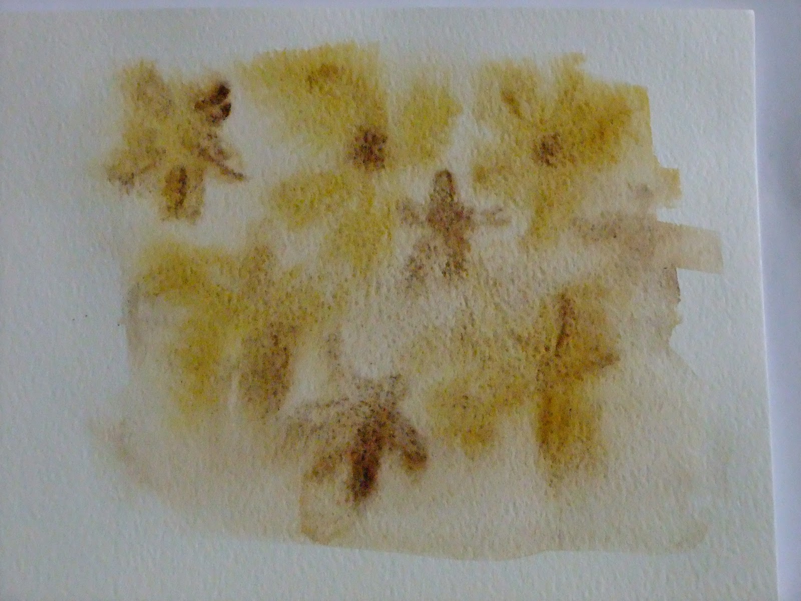
I found it quite difficult to steer away from obvious ways to interepret emotions and concepts (eg. using bright colours for happy, positive themes and murky colours for negative, sad themes). Expressing more abstract ideas such as passive and active was an interesting challenge and I made more use of marks with these terms than colour.
Did the exercise help you to really see colour instead of accepting what you thought you saw?
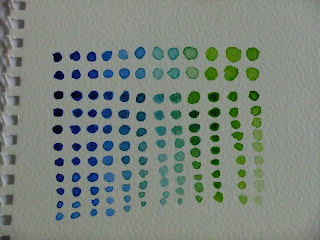
In the colour-mixing exercises I was surprised by the colours I needed to mix to achieve a good match. There were many undertones and subtle nuances of colour in some of the samples I was replicating. For example, in the fabric sample what appeared to be "green" had a much stronger blue content than at first seemed to be the case. I used 10 different base colours (not all in every sample!) to achieve the four different shades in the fabric.
Did you prefer working with watercolours or gouache paints? What was the difference?
I found that that Gouache paints are more controllable and the colours are more opaque, making them more intense and rich. They are my preferred choice for precision work and when I need really lush colours. Watercolours on the other hand are somehow liberating as they have a bit of a life of their own! This is quite good for me as I am a bit tense when it comes to painting so using a medium that requires a less structured approach forces me to relax more which I find enjoyable.
How successful were the colour exercises in Stage 5? Were they more or less interesting than the painting exercises?
I did not enjoy working exclusively with primary colours. I find them quite jarring. I tried to use red-orange with the yellow-orange to give a more harmonious feel whilst staying broadly within the primary colour brief. To cheer myself up I did experiment with some interesting stitches and stitch combinations, varying the proximity and size of stitches to see how the black background interacted with the stitches.
If you enjoyed them more, were there any factors that made them more exciting?
I think that with more freedom of choice as to colour this would have been a more enjoyable exercise. Working with stitch gives additional opportunities to create light and shade through textural stitches. The variety of threads available - different thicknesses, reflective or dull, smooth or slubby gives lots of additional scope for creating pieces with 3-dimensional qualities. Working in stitch is more tactile and satisfying.
Are you pleased with what you achieved? Is there anything you would like to change or develop?
Of the exercises in this project I was pleased with the colour-matching. I also enjoyed the final stage, using French knots to create a representation of one of my watercolours (the poppy head). Although I think if I re-did this piece I would try to get an even wider range of thread colours (possibly finer ones too) so that I can create more subtle shading effects.
Saturday, 30 March 2013
Friday, 29 March 2013
Assignment 2: Project 3 colour - Stage 6 - Combining Textures and Colour Effects - Exercise 2
Combining colours using French knots. Pastel colours this time, and a finished piece...
French knots are an interesting and a very effective way to create subtle colour changes and create a paint-like effect. The effect of so many tiny stitches to create shading is particularly impressive when viewed from a distance. A pity it takes so unbelievably long!


For the final piece of this project I chose a watercolour from my sketchbook. Based on a poppy head from my mother-in-law's garden, this was a photograph of the poppy...

This was my watercolour of the same scene...

From this I selected the head of the poppy as my subject, using a combination of the watercolour and the photograph for colour inspiration. I began with a cartoon sketch on a piece of cotton...

Prepared a series of coloured threads...

And used the threads to create a colour wrap and the finished piece....

And here's how it compares to the photo...

Thoughts:
Some aspects of the finished piece are better than others. The top fluted section and the stem are quite successful. The body of the poppy head is a fair attempt but should have been worked in finer thread to allow more variations when combining the strands for new colours. More colour variations would have given the opportunity for more subtle colour transitions.On the whole though, I am fairly happy with this piece.
Thursday, 28 March 2013
Assignment 2: Project 3 colour - Stage 6 - Combining Textures and Colour Effects - Exercise 1
Using French knots to experiment with colour combining...


Tuesday, 26 March 2013
Assignment 2: Project 3 - Stage 5 - Coloured Stitches
(DISPLAY BOARD PIECE - BOARD 1 OF 10)
Working with primary colours and a selection of different yarns and threads on a black background:
This sample was interesting to see how the density and placing of the colours causes one colour to "pop" while another recedes. The turquoise is clearly the strongest contrast against the black background and lifts each section. In the top right section the use of small turquoise stitches at the edges makes the black and blue more dominant. The red is most visible where there is no turquoise.

Here the dense areas of blue lift the red highlights. The spaced lines of red and blue with black in between brings out the black as a strong contrast

Playing with sizing, spacing and colour...


Using dense stitches woven into a lattice to create a solid mesh of colour...

...and using the same technique to replicate warp and weft in a weave. The similar depth of shade of the two colours means that neither is dominant and they blend together.

Here I've used tiny stitches and combined three primary colours in different combinations. I wanted to see how the colours affected each other where the key variable was just the two colours. Working numerous permutations together allowed this to be seen more easily. The yellow largely predominates over both red and blue and is also a strong contrast against the black background. The pale blue and yellow are the exception, I assume due to the similarity of depth of shade. The red is striking viewed from a distance and is stronger against the pale blue. The deeper blue is dominant against the red.

This was just a bit of fun!

Monday, 25 March 2013
Assignment 2: Project 3 colour - Stage 4 - Colour Moods and Themes - Exercise 2
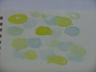
Colour bags
Here are a couple of colour bags I've made up. I hope to be using these at some point during the course!


Here are a couple of colour bags I've made up. I hope to be using these at some point during the course!


Assignment 2: Project 3 colour - Stage 4 - Colour Moods and Themes - Exercise 1
Stage 4, Exercise 1
Expressing opposing feelings using a combination of colours and marks:
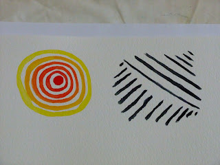
Sad:Happy
Sad:


Happy

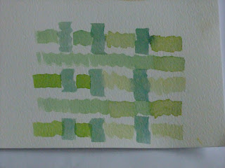
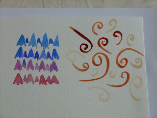
Bright: Dull
Bright
Dull
Relaxed: Tense
Relaxed

Tense:
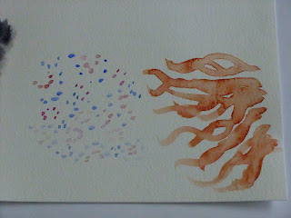
Active: Passive
Active:


Passive:

Conclusion:
Looking at these images, I can see that there is some degree of overlap. Some of these images could fit into several categories ("tense" images also create a feeling of "active", "passive" images are almost interchangeable with the "relaxed" images).
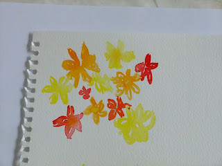
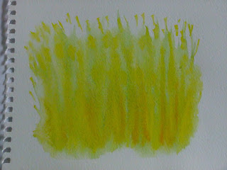
Using strong strokes and intense saturated colours for me creates positive, active sensations. They are bold, striking and deliberate.
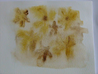
Dilute shades, blurred, watery images in dull colours for me represent the more laid back, passive, but also negative sensations. By employing softer strokes and allowing water to soften the edges and to some extent control the flow of the paint is a passive, non-assertive process.
Expressing opposing feelings using a combination of colours and marks:
Sad:Happy
Sad:


Happy

Bright: Dull
Bright


Dull

Relaxed: Tense
Relaxed


Tense:


Active: Passive
Active:


Passive:

Conclusion:
Looking at these images, I can see that there is some degree of overlap. Some of these images could fit into several categories ("tense" images also create a feeling of "active", "passive" images are almost interchangeable with the "relaxed" images).
Using strong strokes and intense saturated colours for me creates positive, active sensations. They are bold, striking and deliberate.
Dilute shades, blurred, watery images in dull colours for me represent the more laid back, passive, but also negative sensations. By employing softer strokes and allowing water to soften the edges and to some extent control the flow of the paint is a passive, non-assertive process.
Tuesday, 5 March 2013
Assignment 2: Project 3 colour - Stage 3 - Recording colours accurately - Exercise 4
Pr 3, Stage 3, Exercise 4
For the three-dimensional objects I chose these objects:

These were my base colours and colour blends:


And my chosen shades applied to a rough painting of the objects:


I liked this arrangement of objects so I did a couple of pencil sketches as well...


Thoughts:
Some of my greens were brighter than in the photograph and the browns of the wicker ball weren't quite as varied as I would have liked. Although this wasn't about the drawing, I did like the effect I achieved with the flowers and leaves of the potted plant.
Subscribe to:
Posts (Atom)