Expressing opposing feelings using a combination of colours and marks:
Sad:Happy
Sad:


Happy

Bright: Dull
Bright


Dull

Relaxed: Tense
Relaxed


Tense:


Active: Passive
Active:


Passive:

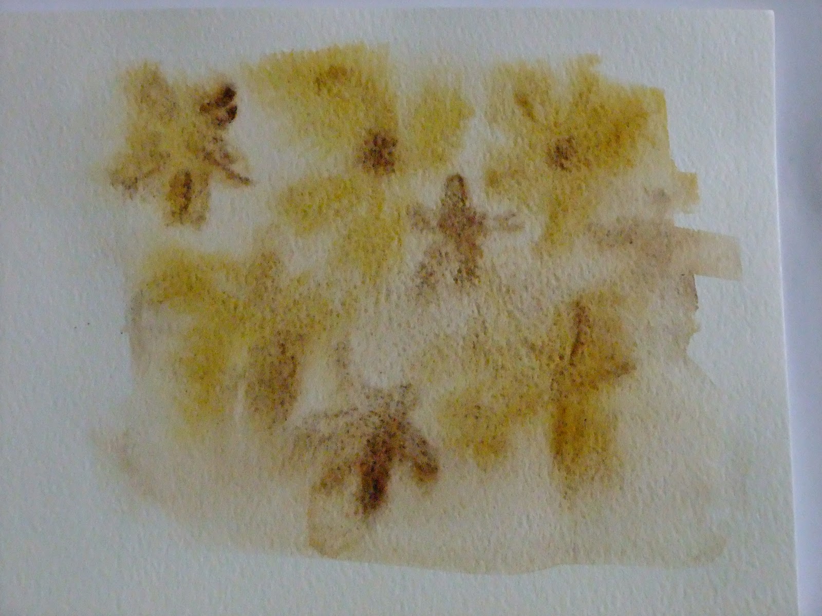
Conclusion:
Looking at these images, I can see that there is some degree of overlap. Some of these images could fit into several categories ("tense" images also create a feeling of "active", "passive" images are almost interchangeable with the "relaxed" images).
Using strong strokes and intense saturated colours for me creates positive, active sensations. They are bold, striking and deliberate.
Dilute shades, blurred, watery images in dull colours for me represent the more laid back, passive, but also negative sensations. By employing softer strokes and allowing water to soften the edges and to some extent control the flow of the paint is a passive, non-assertive process.