Showing posts with label Display board piece. Show all posts

Saturday, 1 March 2014

Assignment 5 - Project 10 - A Design Project - Supplementary Work Part One - Stitched Waistcoat

(DISPLAY BOARD PIECE - SENT SEPARATELY DUE TO SIZE/WEIGHT)

Feedback from the tutor for assignment 5 highlighted some areas where I need to do further work (see here for action points and my thoughts).

Having carefully read the tutor feedback and reflected on the work I submitted for Assignment 5 I decided to produce an alternative piece for this assignment. In the event I am submitting two additional pieces as I feel that both express different aspects of waves and have very different qualities.

The first piece retained the template and essential wave structure of the silk-painted piece. For this piece, however, I interpreted the design in stitch. I hand-dyed a range of yarns using a hand-painting technique and procion mx dyes. I tried a range of different yarn types, drawing from the experience gained in the braiding and weaving exercises where I combined different yarn and fibre types to achieve a range of effects. I dyed:

Wool, wool-silk blend (2), superwash wool:

(L to R): Wools (2), cotton, raw silk, Wensleydale aran, Viscose chenille

Wensleydale aran, raw silk, silk (2), cotton, Wensleydale aran

I then tried several combinations to see which yarns worked best together.

Wool, wool-silk

Pure silk

Pure silk, wool, silk, wool-silk,

Wool, wool-silk with goldfingering (centre)

Pure silk, goldfingering, silk

I wanted the waistcoat to be rich and opulent with deep, intense colours and I found that the pure silk with the goldfingering best achieved this. The wool was a little dull, the Wensleydale too fuzzy, the raw silk was nice and might have made an interesting contrast but was thicker than the pure silk. Again, the cotton was a quite nice, soft contrast but a little thick. The viscose chenille was not suited to stitching at the intended stitch count as there was excessive wear on the yarn and it shed its chenille tufts. For these reasons I selected the pure silk with an accent of goldfingering for sumptuous, rich colour and the glitz of the gold.

Kaffe Fassett is one of my personal favourite artists, both for his amazing use of colour and for his ability to interpret his art in a wide variety of media (knitting, stitch, patchwork, fine art, pottery and fabric to name just a few). I particularly like his needlepoint work and how he takes needlepoint beyond the traditional cushion cover, sampler or hanging into less territory with furnishings, clothing and even shoes. Having seen a number of Kaffe Fassett waistcoats at his recent exhibitions - some knitted, some stitched - I particularly admired the elegance and simplicity of the design in this piece. The style is simple, the colours extravagant (it is Kaffe Fassett after all) and the finished piece looks wearable but head-turning.


I also took inspiration from classic waistcoat forms as I wanted to produce an artistic, hand-crafted twist on a classic garment, placing the emphasis on the uniqueness of the fabric rather than the garment styling.

Vintage silk waistcoat

Vintage wool waistcoat

The colours I have chosen are perhaps more subtle than a Kaffe Fassett but I feel that the shapes and the use of the goldfingering still draw the eye. Worked in different colours this design would be equally adaptable to both men's and womenswear.


The placing of the stripes was quite deliberate so as to match across the front once fasteners have been added. I am thinking Chinese-style frog fasteners at the moment to give a vintage feel. Something simple such as this:

Or with a little more bling (in gold for this waistcoat but shown here in silver):

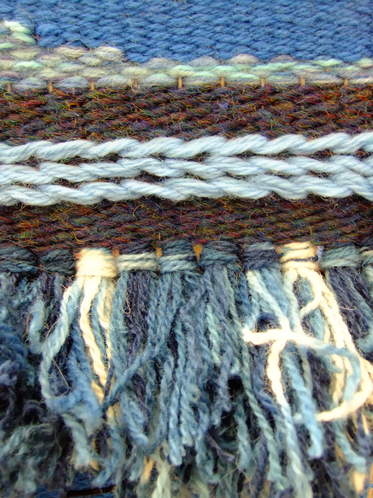
I used a pre-purchased waistcoat pattern for the design, choosing a simple pattern over something more complex to avoid overpowering the design itself. I then printed a large chart using a stitch program. I sketched out the repeating wave shape on tracing paper and overlaid this on the chart. I produced two separate charts, one for each front, taking account of the need for the fronts to match when fastened. The back and lining were a satin in a co-ordinating colour. Elastic cinching at the back enhanced the fit.

As I was concerned about the suitability of the aida for a garment, I made and washed a sample. Although the finished piece is quite stiff, once washed the aida softens, giving it sufficient flexibility for a garment. With careful washing this waistcoat should withstand reasonable wear.


Thoughts:
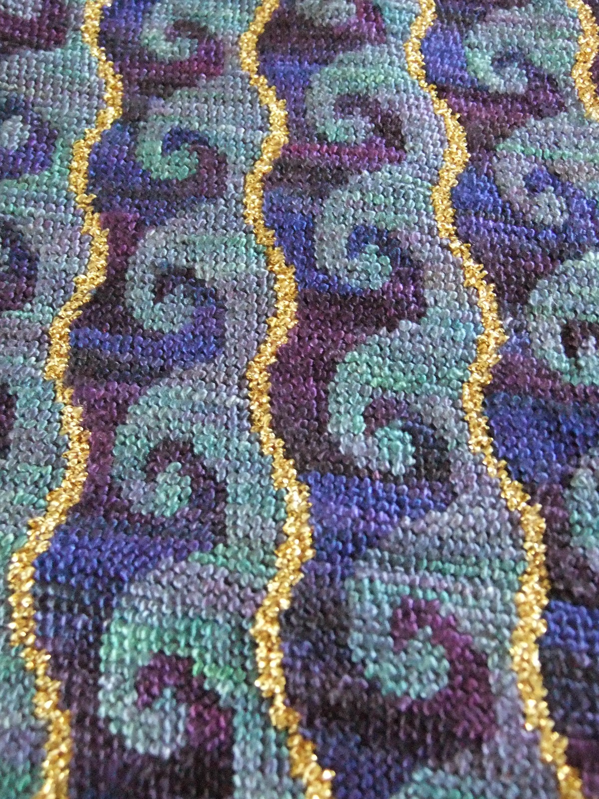
The use of hand-dyed yarn gives the design subtle tonal qualities which reflect the many shades of the ocean waves. The design is simple in shape but is in keeping with a classic striped-style waistcoat, an essential part of the inspiration for this project. The patterning is detailed but the use of a simple repetition in the motif gives a smooth line, making it less visually intense.

Friday, 22 November 2013

Assignment 4 - Project 9 - Woven Structures - Stage 4 - Part Two - Developing Design Ideas into Weaving

(DISPLAY BOARD PIECE - BOARD 7 OF 10)

For this sample, inspired by the pleasing rustic appeal of the Mexican god's eyes, I chose natural materials for the frame, a piece of dried twig and a small dowel. I wanted to explore the relationship between the warp and the weft, playing with the interaction between the two. In my mind was the idea that in some weave structures the warp is the dominant force (warp-faced weaves such as ikat) whereas others have a dominant weft structure (weft-faced weaves). I was curious to explore not only the warp and weft-faced weave structure but also what happens if the warp is entirely exposed.

I realised that this would create a potential weakness in the weave but as it was for a decorative sample I did some research and discovered that it is possible to paint the exposed warp with dilute pva or starch to stiffen and strengthen it.

As I wanted some exposed warp sections, I chose an interesting-textured boucle yarn which was fine but strong.

I also wanted to experiment with different materials in the weft. I wanted to see how far I could push the open weave structure before it failed to work. I drew inspiration from the earlier braids exercise and selected a range of hand-dyed and commercial, textured threads - wool, raw silk, cotton and viscose. I included some hand-dyed, handspun wool yarn but also bulkier materials - hand-dyed fleece, roving and even as thick as braids. For the dyeing I used natural dyes - I used goldenrod overdyed with woad for the greens, coreopsis, goldenrod for oranges and yellows and iron-modified cutch for the lighter browns. The darker browns were naturally-coloured fleece/wool. I also incorporated a small amount of commercially-dyed yarn in the braids.

Design inspiration
The inspiration for the piece itself was piles of richly-coloured autumn leaves, laying on the ground in a dense forest, with moss and lichen visible through the piles of leaves as they crumble and decay. In the open areas the leaves have disappeared, returning to the soil to nourish the forest. Rich grey and brown handspun yarn represents the deep, rich humus and gnarly roots poking through the leaves. The lichen and moss are growing around the base, thriving in the cool dampness beneath the forest canopy.

Design process
I used starch paste to stiffen the boucle thread to make a very simple warp.

Onto this I wove a range of materials, fibre, fleece, yarn, string. I left parts of the warp completely unworked, some lightly packed to allow the warp to remain partially visible whilst other areas were densely filled and woven over. With the fleece, I left tufts at the front, anchoring them into some strong rug yarn.


I drew on the earlier exercise (3) to make a number of twisted and braided cords which I attached to the bottom of the piece.


I completed the piece by applying additional dilute pva to prevent movement in the open warp sections.

Thoughts
I like the textural qualities of this piece and the natural forms. The warp is somewhat light for the weight of some of the weft materials but I like the concept of exposed areas - as well as reflecting the original design, it gives an impression of an old piece that has seen many years of wear and is itself in the process of slow decline. The use of natural dyes for the hand-dyeing added to the natural qualities. When I was working the piece it also had an earthy smell which added to the making experience. It would be interesting if this smell remains - it would add an extra dimension to experiencing the piece. (note to self: wonder if this could be used more widely - fragrance-infused pieces to evoke emotions/images?)

If I were to repeat this piece I might use a thicker warp, but  still with texture. I would also lose some of the braiding - it proved a little excessive!

Tuesday, 19 November 2013

Assignment 4 - Project 9 - Woven Structures - Stage 3 - Part Two - Experimenting with Different Materials

(DISPLAY BOARD PIECE - BOARD 6 OF 10)


For this sample I decided to develop one of the pieces I prepared for the interlude. The collaged images were originally inspired by the word "Bleak" and I assembled a range of yarns and other materials to reflect one of the images. From the collage I created the preparatory yarn wrap.


The resulting piece aims to recreate the image. However, I originally made the wrap assuming following the lower edge working right to left. For this reason, the mounting on the board is arguably upside down!

On reflection, I think the piece works better working left to right across the lower edge, anchoring the heavier, more solid elements at the bottom of the piece. Looking at it afresh, with the wool and plastic at the top it seems top-heavy so I think it should be displayed the other way up. (Interestingly, I wove it following the colours and textures in the image left to right).

Starting with a rough grey Herdwick wool (a hill sheep specially adapted to living in the bleak, harsh conditions in areas such as the North Lakes so very appropriate). This represented the rough, snow-covered ground.

Grey, biodegradable, recycled packaging bags for the fencing.

More wool to anchor the plastic and create more rough, snowy ground, followed by a layer of loosely woven waste synthetic quilt wadding. This made great snow.

A black and grey boucle yarn and a deeper grey wool were woven together using a curved weft to create undulating snowy/gravelly ground. Next I added two rows of Soumak using strips of soft, sheer polyester fabric remnants. A further layer of snowy boucle scrub leads into a final sturdy layer of denser hedgerow.

Thoughts:
My first thought here is about the longevity of the piece. In using a biodegradable plastic I've probably given myself a bit of an issue in the longterm. Next time I'd either use a less environmentally friendly plastic or swap this for a different material, perhaps a grey/black tweed or similar wool-based variegated fabric.

There is some visible hemp warp here but it blends well with the other colours in the piece, giving the impression of rough grass stalks. It also needed to be sturdy to hold the stronger materials such as fabric, plastic and strong wool. A finer warp might have frayed or broken.

The upside-down mounting aside, I really like this piece. The monotone colour scheme creates harmony and the different materials give texture and interest. My piece isn't perhaps quite as bleak as my images but it still works well for me. Using an abstract concept was an interesting thing to interpret as a woven piece.

Action points:
Consider materials used and any specific needs. Using a short-life plastic for a piece that may be expected to have to last a number of years in a display setting, particularly, for example, if mounted outside or in bright sunlight would be potentially disastrous.

Although I had evaluated my yarns and done a yarn wrap, a smaller sample weave or additional wraps would have most likely flagged up the issues with the proportions of the various materials. I need to take more time to sample and resist the urge to get straight into a project.

Monday, 18 November 2013

Assignment 4 - Project 9 - Woven Structures - Stage 3 - Part One - Experimenting with Different Materials

 (DISPLAY BOARD PIECE - BOARD 5 OF 10)
This second attempt at warping was far more successful - quicker and right first time! Warping correctly gave a little over a metre of continuous warp to work with. I made individual looped heddles made from short lengths of knotted hemp (the warp was also hemp) which took a while but these will be re-usable and it was easier to maintain the tension on the warps than it was when wrapping a single thread around the heddle dowels.


For this piece I worked with a colour range of pinks, purples and greys using wools and a number of more unusual materials, plastic bubble wrap, straws, plastic, fabric and wadding.


Thoughts:
It was fun to work with a variety of materials, however, more attention is required when tensioning the weft. As I left some of the warp open, I would have to consider whether it would be necessary to fix the wefts in place in some way to prevent the wefts sliding out of place.
 I have done this by painting the wefts with dilute pva in the past so this is something I might try. The tricky part would be any textured yarns and avoiding flattening or spoiling the textural qualities in the wefts. (Perhaps focussing on fixing on the warps above and below the weft threads?).

The bubble wrap was particularly interesting and refracted the light well. This could be used successfully to add light, reflections or sparkle. Being translucent, of course, care would need to be taken with the colour of the warp. (Is there a translucent fibre that would be strong enough as a warp or are all translucent threads too stretchy?).

The straws were fun but I can't see an immediate use for these as to me they looked too much like, well, straws.

Action points

Warping is a long process and I could have tried a smaller sample on cardboard (as in the earlier exercise) to see how these materials interacted before I committed myself. This could have been a time-consuming mistake in a larger piece.

I think I should also consider whether using unusual materials such as straws really works and not include them just because they are unusual. Having the confidence to go back and re-work or remove parts of a design that doesn't work is something I should be seeking to develop. Again, more sampling would have helped as maybe a different style of weave above and between the straws might have made the design work better.

Assignment 4 - Project 9 - Woven Structures - Stages 1 and 2 - Preparation and Basic Weaving Techniques

(DISPLAY BOARD PIECE - BOARD 5 OF 10)
Warping up

First, a spot the obvious mistake question. Yes, that's right, instead of taking up warps from just one side of the warp bar, I somehow managed to pick alternate warps from either side :-(
After reading and re-reading the warping instructions and watching a number of online tutorials, I realised that I'd warped only half the required number of ends and what should have been a rolling warp of 40 ends was in fact only 20. To make up the desired 40, I was effectively weaving the two warps together.
Fortunately, there was enough movement in the warp as it was to make the first sample piece.

Selecting the yarns
For this I selected yarns, threads and other materials in a range of shades of blue.

Starting to weave
I used a hemp warp and a hemp edging, then wove in plain weave using 2 shades of a basic blue knitting yarn.


I continued with short lengths of naturally indigo and woad dyed wool, making Ghiordes Knots across the warp, using 9 4-ply threads per pair of warps. I worked 2 rows of plain weave, followed by another row of knots.


Several rows of thick wool followed by a row of 3 rows of Soumak, interspersed with 1 row of plain weave. For the Soumak, I worked 2 of the rows weaving right to left, the third row I reversed the direction of the wrapping and worked left to right. Pairing a left with a right direction created an interesting effect, rather like chain stitches.

After several more rows of wool plain weave, I wove a section using curved wefts.


After levelling the warp with several rows of plain weave, I finished the piece.


Before cutting the piece from the warp, I trimmed off the knots to give a satisfyingly dense and fluffy texture.


After cutting the piece off the warp, I knotted the ends in pairs.

Thoughts:
Setting up the warp was complicated and time-consuming (as evidenced by the fundamental error). However, once weaving was underway, it was fascinating to watch the fabric grow and it progressed relatively quickly.

This first piece was purely experimental, however, it was interesting to note that, when viewed from a distance, the fabric had a very landscape feel to it. The lower section was reminiscent of sea with foaming waves (the knots). The Soumak created a horizon line above which the tonal dark blue/brown gave the impression of hills surmounted by clouds and sky.

Action points
Although this piece was not formally planned, it's clear that it would be possible to recreate quite complex and attractive imagery using this technique. It would also be interesting to explore possibilities offered by the knotting process, perhaps making a graduated fabric varying the colours used in each knot across (or up the piece) as it progresses to achieve subtle shading.
Making the curved wefts took a little practice to persuade the pieces to fill in without gaps and also to get the tensioning right.

The hemp warp used was strong and had a certain amount of grip which made the wefts easier to push together. However, for a proper project I would need to consider carefully how to finish off the top and bottom edges. Perhaps binding with fabric? The hemp was too stiff to be readily woven in and wouldn't hold a twisted cord/plait readily. The hemp could have been softened first but this would have potentially made the warp too floppy and difficult to keep tensioned. This is something which needs further research.