Wednesday, 1 January 2014

Assignment 5 - Project 10 - A Design Project - Silk-painted, hand-stitched and quilted waistcoat sample

(DISPLAY BOARD PIECE - BOARD 7 0F 8)

Following on from my experiments, I concluded that I liked the effect of the silk painting but preferred the pattern used for the felting. I therefore decided to combine these two aspects into a further design. I had used wadding in earlier exercises and found that this was a good way to add depth and texture without weight.

I began with the pattern sketch..

And the translation of the sketch onto a waistcoat front...

I then used graph paper to plot out the pattern so it could be traced out for a repeat pattern....

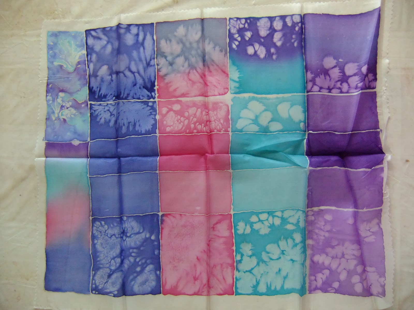
On the graph paper I tried out a sample colourway based on the original source material and the subsequent silk samples...


I worked this up into a sketch to see how the design and colour scheme might look in practice...


As the waistcoat would be viewed primarily from the front, I concluded that it would be more cost-effective, practical and comfortable if the back of the finished waistcoat was made with a satin fabric in a co-ordinating colour. A standard dressmaking pattern sourced from an old magazine provided the basis for the full-size waistcoat and I used this to create a large scale template on graph paper. This gave the basis for the dimensions of the pattern and the best size for the repeat (pattern and graph paper mock-up can be found in the theme book).


I used this article to refine my techniques for silk painting and using gutta as my initial results, whilst acceptable for sampling, were still a little random and I didn't want to waste precious silk. I also used Painting on Silk by Jill Kennedy and Jane Vassall.


Final sample
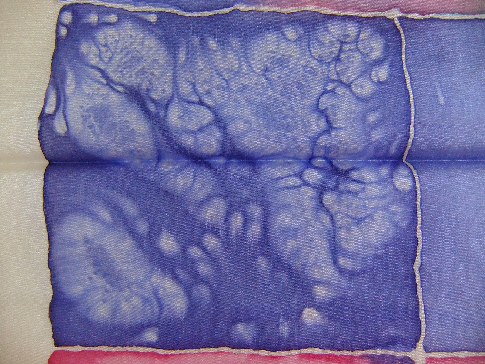
For the final sample I created a section of the front of the garment at actual size. I began by tracing the wave shapes onto parchment paper using black marker pen. The marker pen lines were drawn thickly enough to enable them to be seen through the silk. I stretched and taped the silk to a silk painting frame then laid it over the tracing. I used clear gutta to outline the wave shapes and allowed it to dry. I then used steam-fix deka silk paints to paint the silk, working carefully to ensure that the paint didn't bleed across the gutta lines.

One change from the original sketch plan was to use a crimson silk paint and a fine gold gutta outline instead of a thicker gold line to delineate the wave repeats. I felt that gold would be too heavy if worked entirely in gold metallic paint as the metallic fabric paints tend to be stiffer than the normal paints. They also have a tendency to flake off when flexed or during washing. This would limit the practicality of the fabric for a garment. Stitching a solid gold thread would need to be done in a satin stitch which would, I felt, be too dominant and could distort the fine silk fabric.

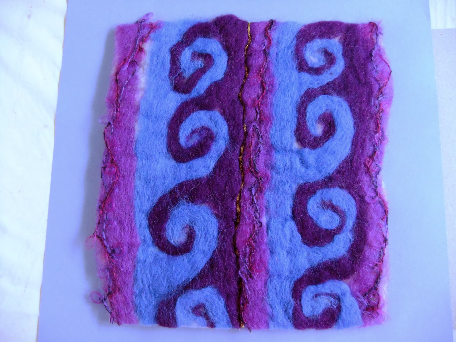
Once the fabric was dry and the gutta had been removed, I cut a piece of thin wadding and tacked it to the silk. I then used machine-stitching to outline the wave shapes in white thread. At this stage the piece was taking shape but the waves were flat and uninteresting, so I used a variegated metallic thread and hand-stitched into the waves to create sparkly highlights. I also hand stitched in gold thread along the dividing crimson wave lines which gave lift and additional texture. I also added a sprinkling of metallic and pearlized seed beads along one of the repeats in the sample to create flecks of foam. I wasn't sure if this would be too much but I think that it adds life, interest and a sense of movement. Interestingly, although it wasn't strictly planned the use of the clear gutta left a white outline around the crests of the waves which gave them life and the appearance of seafoam.


Assignment 5 - Theme Book - Experimental Work

Armed with a wide range of images, ideas and possible strands for idea development I felt ready to do some trial designs.

Drawing on my wave theme I selected some source images from my collection that I felt had potential for development into interesting designs. A greetings card provided the inspiration for the wave shape....


A postcard provided the colour inspiration....


Before I finally settled on waves as my theme I experimented with alternative interpretations of ocean/water themes from my mind map. Utilising the colours on the card, I made a selection of drawings and samples extrapolated from words that I felt were appropriately expressive and creative.

I selected splashing, undulating (rippling) and crashing (waving).

Beginning with the basic idea I made a very quick line drawing for each of my chosen words. I wanted a bold, simple image that could be readily translated into a range of different forms - scalable and with scope for interpretation across different media.

Splashing

Undulating (rippling)

Waving

 Once I was happy with the line drawings, I painted a ceramic tile thickly with gouache paints and used a cotton bud to recreate the image that represented my chosen words. I then used paper to create prints of each image.

Splashing


Undulating


Waving

For the next stage I considered how each pattern could be developed into a finished textile project. My initial idea had been to create a waistcoat so I drew a couple of quick sketches showing how the pattern might be applied to the fronts of a waistcoat.


Splashing

Undulating

Waving (horizontal)

I also tried a slightly quirkier version, adding in the dolphin's tail emerging from the waves...

And a coloured version....

Splash design
I liked the splash image and thought this would look interesting on silk, so I tried sampling various colours, using deka salt to create the foam/bubble effect and table salt for smaller droplets.


I experimented with a clear gutta to create the splash and droplets.


 I did a further sample using gold gutta and fine table salt to create bolder, highlighted splashes and delicate droplets...


Conclusion:
I liked the colours of the silk samples and the splashing pattern was really quite attractive with the fine salt and the gold or clear gutta. However, I didn't feel that the pattern would scale up well and it didn't look right in the pencil sketch as a repeat pattern. It was also quite difficult to achieve the desired effect and it was slow to create. This would make it impractical for a project which was for resale. I'd like to come back to this for a different project, perhaps a cushion or bag front, or maybe a long wrap?

Wave design
For my next sample I chose the wave design. My initial sample used hand-stitched chain stitches worked in hand-dyed stranded cottons onto hand-marbled thin card. The card would be replaced by a fabric in the finished piece. I mounted this into a dolphin's tail for added interest.

Conclusion:
Again, this was a time-consuming sample to make, particularly taking into account the hand-dyeing and hand-marbling. This could be speeded up by using a commercial space-dyed thread and by using a marbled fabric. The sample could be resized and the scale altered, however, I feel that this design would be very intense covering the entire front of a waistcoat. It would be interesting to play with other mounting shapes and perhaps to use a wadding/quilting and maybe reverse applique for a fun book cover, cushion front or bag.

Wave design (vertical)
As I still liked the wave pattern I decided to try an alternative medium. For the next sample I turned the design through 90 degrees to create a vertical repeat. I added a wave-line to delineate the repeat and create a strong vertical line.

I then sketched this onto a waistcoat front....

Felt sample
I used pure wool and a wetfelting technique to create this pattern. For the lines I added a hand-stitched gold thread.


Conclusion:
This piece was heavy and lacked drape so wouldn't be suitable for the intended waistcoat project. It would, however, be suited to a project requiring a more sturdy fabric. I wouldn't completely rule out a garment but it would need to take into account the weight and stiffness of the resulting fabric. Perhaps an outer garment? Alternatively, it would be a great pattern for a rug, large bag/holdall or soft furnishing. It may be necessary to needlefelt the finer parts of the design and to wetfelt more thoroughly if using for an object which would be subject to wear as otherwise pilling and fluffing may occur.


Thursday, 19 December 2013

Assignment 4 - Action Points and Thoughts From Tutor Feedback

The tutor feedback has been very useful, in some cases confirming issues I had already identified such as the weight of the warp and the need to sample more carefully, but also in suggesting ways in which issues arising from some of the pieces could be avoided or resolved. For example the use of thinner strips of materials and plastics would allow me still to use material but in a way that is more effective.

Project 8: Exploring structures
Weaves:
I struggled with creating alternative weave structures and the tutor has made some excellent suggestions. Having done some research, I have a clearer picture of what was being asked for in this exercise and have found some useful suggestions for future projects. In particular, I have been looking at willow weaving, weaving in floral arrangements and woven wire structures that I may revisit.


Braids and ropes:
I enjoyed creating the braids and ropes and, having read the tutor's suggestions and seen some of the amazing wire work of Walter Oltmann (see above) I am very keen to explore wire as a means of creating fabrics and 3-dimensional sculptural pieces.

Project 9: Woven Structures
Weavettes and God's eyes
Having used the small carboard looms to produce quick samples it would have been sensible to repeat this for the larger samples. A useful point to consider for future projects.

Mexican God's eyes are very pretty. It would be fun to do more of these with different materials and to explore different sizes.

Woven samples
Very valid points raised by the tutor and some of the points raised I have identified however the tutor has offered some very useful ideas on how to resolve (and prevent) these issues.

Project 9: Experimenting with different materials
Bleak piece
The tutor has offered some useful food for thought on interpreting images into weave. I can see that there is significant potential to go beyond simply interpreting colours and textures but also to think about shapes and how a whole image can be used as the basis for a weave not just a selected element of it.

Autumn piece 1
The tutor's comments came as no surprise and I agree wholeheartedly with the observations made. I need to sample more carefully and consider the warp as much as the weft! With more experience and practice I will hopefully be able to predict more accurately what will happen to a weave once it is removed from the loom and avoid this issue by addressing the suitability of the warp for the materials, the weight and density of the materials and their arrangement in the piece. More sampling would have been useful here and is a lesson learned.

Autumn piece 2
Having been determined to crack the open warp problem I thought I had handled this better in this piece by stiffening the warp with starch and pva. However, there was still the issue of the bottom-heaviness of the piece. I am finding it difficult to translate from the wrap to the weave but should have picked up this issue earlier on in the process and changed tack. This is something I need to work on and if something isn't working, go back to the drawing board and re-think before continuing.