My first image was a postcard from my collection.

I isolated the main colours then worked up the colours for each section using Windsor & Newton Cotman Watercolours, annotating the colour components of each colour swatch at each stage. The selected images (ticked) were then used as the basis for the yarn wrap.

It was interesting how some colours were very quick to match, others (4, 6 and 7 in this case), were really quite tricky.

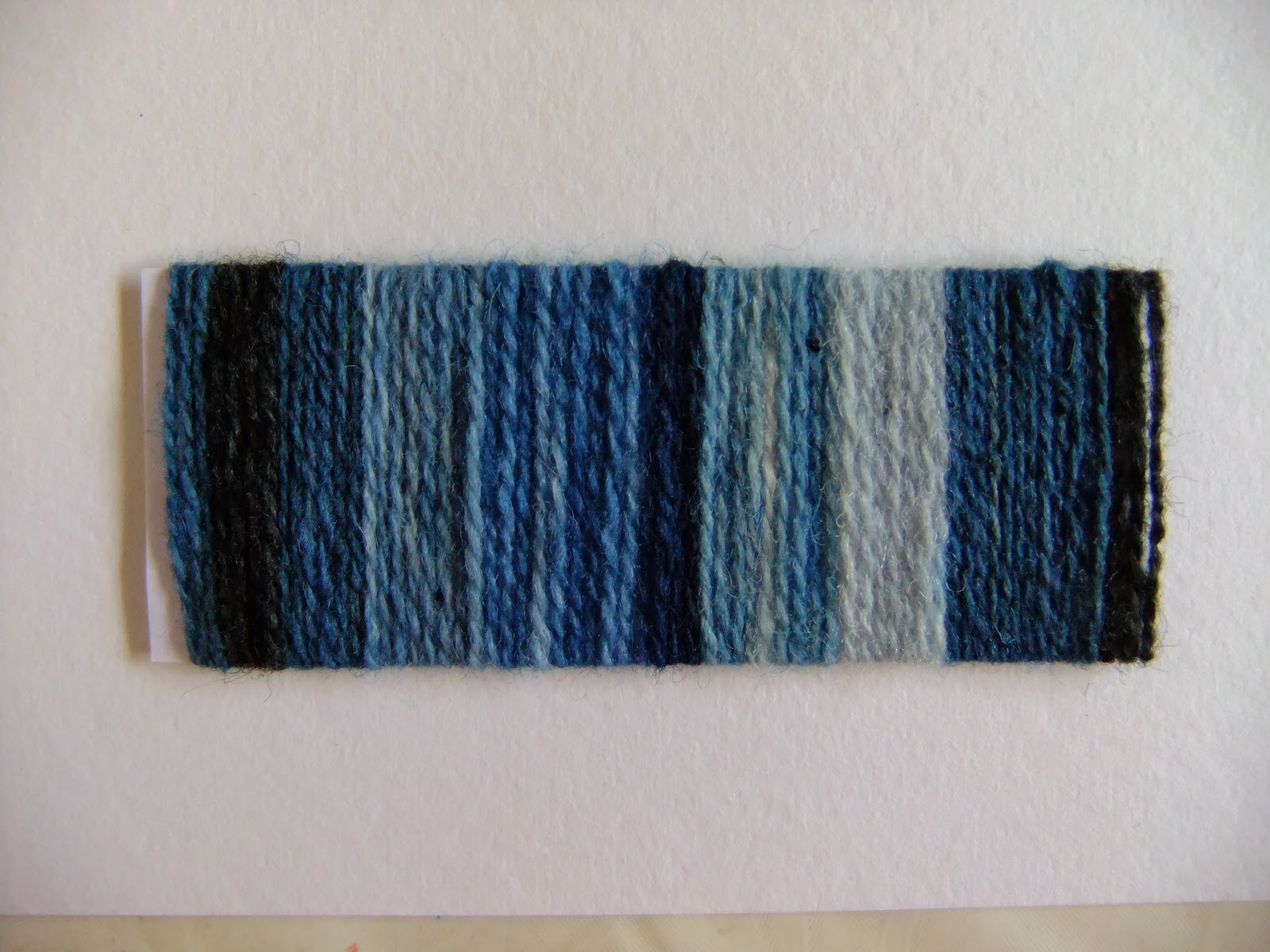
I focussed on the colour for this wrap, using a range of naturally woad and indigo-dyed wool yarns. Although ostensibly very similar in colour, viewed in natural light there were subtle differences that captured the subtlety of the largely monotone postcard.
For my next wrap I made up a mood board with a selection of photographs. The theme for the board was "Bleak" and the plan was to make a wrap based exclusively around neutrals - black, white and grey. Bleak also made me think of desolate, lost and abandoned so I used mainly waste fabric, offcuts of yarn, plastic packaging, waste pieces of wadding - things that would normally be abandoned or thrown away.


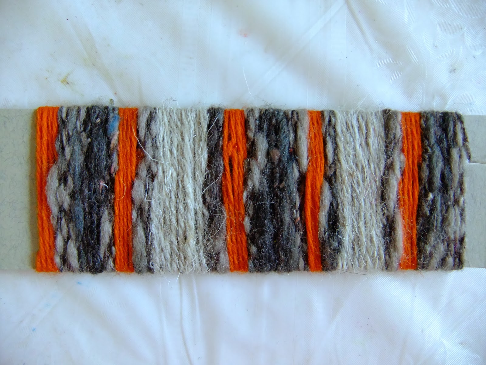
I also tried a couple of intuitive wraps, working straight from my pile of yarns. One I've warped up for an inkle braid which is warp-faced so the wrap will accurately represent the plan for the pattern. The second was inspired by autumn colours following a canalside walk.