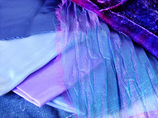
This exercise involved a lot of digging - collecting up fabrics from all the hiding places in the loft, at the back of cupboards, under the bed (I can say this as I'm pretty sure my hubby doesn't read this blog!). I have to say that I don't like cutting up fabric just for sampling. I'm always worried I won't have enough when I want to use it for a real project!
Nonetheless, I found much more variety and interesting material to work with than I anticipated. These are a few of the fabric collages I made....
I worked with several colour themes, exploring texture, proportion and arrangement . It was interesting to view the collections at actual size but then to see how different aspects emerge when viewed as photographs. The structure of the shapes, both the positive and negative shapes is more apparent when seen as a small image and would, I think, lend itself well to a format for repeating patterns. Texture is naturally best appreciated on a larger scale and in real life, but the variations in reflectivity, tone and saturation are interesting to observe in both the photographic and real forms.
These two samples, for example, share similar shape/layout and proportion of each colour, but changing just one fabric (removing the lilac cotton and replacing with the two-tone blue/purple ruffled voile) has really changed the tone of the collage. I find the first image more pleasing than the second as it is warmer and more harmonious. The second image is okay but for me has a coolness and lack of zing.
By contrast, using the voile as an overlay in this sample brings out its two-tone colouring, the structure of the gauzy fabric and the ripple effect. Pairing it with the sumptuous velvet (top right) adds to the overall effect and being able to see the other fabrics behind the voile gives it a subtle harmony. It also has a freer expression due to the random arrangement of the pieces.
These two sets are also interesting. I like the addition of the burgundy/gold stripe fabric in the top set. It makes the fabrics pop. The lower image is very harmonious but hasn't got much wow factor, despite the gold lame!
I also experimented with neutral colours and this was surprisingly pleasing. This set for me is very open and bright, with interesting textures.
This set, on the other hand, is more "closed", almost introverted. The top image speaks to me of calmness and airiness whereas the second image almost sucks me in like a black hole!


