Exercise 3
For this exercise I chose an image of a plant I photographed at the Eden Project (I didn't make a note of the name which is a bit frustrating but we usually there at least once a year so I'll have to go this year and hope it's still there!).
I printed the photograph onto A4 paper to give good-sized areas of each colour. I played with the viewing frame and eventually settled on this section as representing enough shades but choosing ones that gave a complementary range.
This time I used even more base colours!
I specifically tried not to focus on painting the image but used broad strokes to capture the essential features and location of the colours
Monday, 4 March 2013
Assignment 2: Project 3 colour - Stage 3 - Recording colours accurately - Exercise 2
Exercise 2
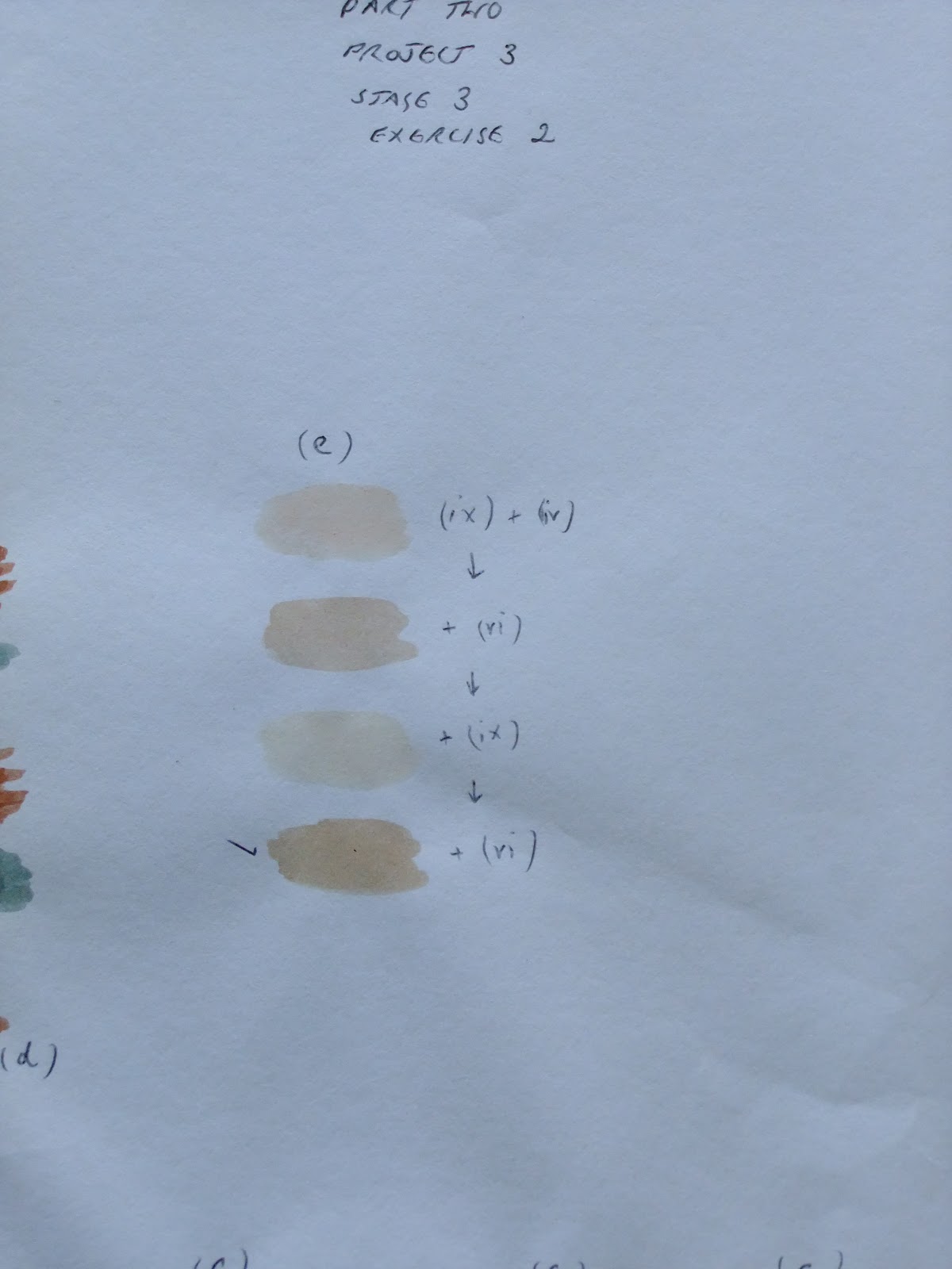
For this exercise I chose a piece of furnishing fabric with a range of subtle tones. Matching colours to images and fabrics is one of the main ways I create yarn colourways (although I'm working with dyes rather than paints). For this process I start with the base colours then paint a blob of colour each time I add a new shade/dilute with water etc. I record each step alongside the blob of the new colour. I then keep the swatches so that I have a recipe book of dye shades for future reference.
For this exercise I followed the same process with watercolour paints. As you will see from the pictures, some colours took a while! I didn't always use the final colour as the changes when the paints dried meant that sometimes earlier colours were a better match.
Starting with the base colours...
Building each shade in the fabric....
And the finished piece...
Thoughts:
Overall I think the colour matching was quite successful. What surprised me was that the hardest colour to match was the palest shade, I think because there was so little pigment needed and it had to be just the right colour before adding white/water. I also used more base colours than I anticipated. This would be an interesting exercise to repeat with dyes using the same piece of fabric.
For this exercise I chose a piece of furnishing fabric with a range of subtle tones. Matching colours to images and fabrics is one of the main ways I create yarn colourways (although I'm working with dyes rather than paints). For this process I start with the base colours then paint a blob of colour each time I add a new shade/dilute with water etc. I record each step alongside the blob of the new colour. I then keep the swatches so that I have a recipe book of dye shades for future reference.
For this exercise I followed the same process with watercolour paints. As you will see from the pictures, some colours took a while! I didn't always use the final colour as the changes when the paints dried meant that sometimes earlier colours were a better match.
Starting with the base colours...
Building each shade in the fabric....
And the finished piece...
Thoughts:
Overall I think the colour matching was quite successful. What surprised me was that the hardest colour to match was the palest shade, I think because there was so little pigment needed and it had to be just the right colour before adding white/water. I also used more base colours than I anticipated. This would be an interesting exercise to repeat with dyes using the same piece of fabric.
Wednesday, 27 February 2013
Assignment 2: Project 3 colour - Stage 3 - Recording Colours Accurately - Exercise 1
Exercise 1
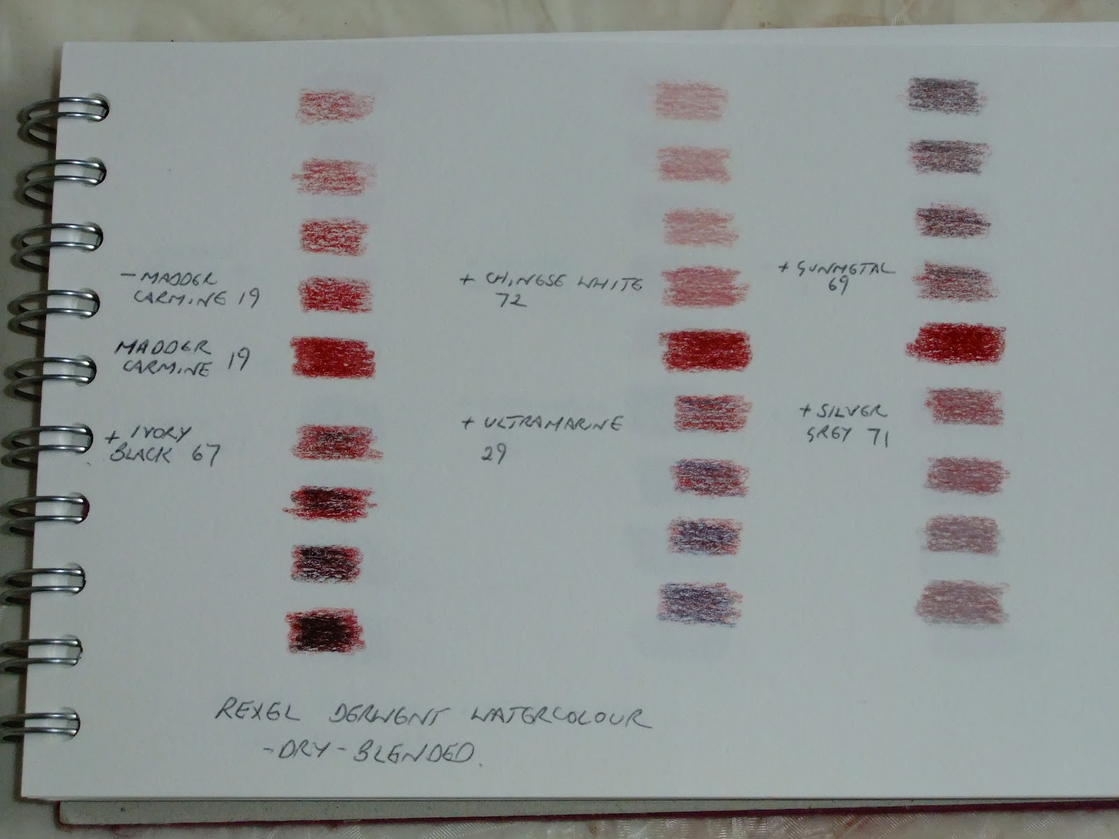
For this exercise I chose a series of colours working a sample in watercolour paints and in watercolour pencils. For each sample I started with the pure colour along the centre line.
I then...
Reduced the amount of colour (top left)
Added black (bottom left)
Added white (centre top)
Added a complementary (centre bottom)
Added a dark grey (right top)
Added a lighter grey (lower right)
My first samples were using madder carmine pencil dry-blended with chinese white, ivory black, ultramarine as the complementary, gunmetal dark grey and silver grey for the light grey.
A similar colour grouping using watercolours - alizarin crimson with ivory black, Chinese white, sap green complementary, grey.
For the second set (same process) I chose Naples yellow and dark violet for the complementary, dry-blended...
...and wet-blended
Set three was grass green pencil and scarlet lake as the complementary. Again, dry-blended...
...and wet-blended
The last set was watercolour using cadmium orange and cerulean blue as the complementary.
There were interesting differences when adding black compared to adding a complementary shade. The complementary is more subtle and tends towards brown. Adding white as opposed to simply using less pigment is also quite different. Of course this wasn't a very scientific experiment as there was no measurement of the various colours used and the proportions, but it was a fun exercise.
For this exercise I chose a series of colours working a sample in watercolour paints and in watercolour pencils. For each sample I started with the pure colour along the centre line.
I then...
Reduced the amount of colour (top left)
Added black (bottom left)
Added white (centre top)
Added a complementary (centre bottom)
Added a dark grey (right top)
Added a lighter grey (lower right)
My first samples were using madder carmine pencil dry-blended with chinese white, ivory black, ultramarine as the complementary, gunmetal dark grey and silver grey for the light grey.
A similar colour grouping using watercolours - alizarin crimson with ivory black, Chinese white, sap green complementary, grey.
For the second set (same process) I chose Naples yellow and dark violet for the complementary, dry-blended...
...and wet-blended
Set three was grass green pencil and scarlet lake as the complementary. Again, dry-blended...
...and wet-blended
The last set was watercolour using cadmium orange and cerulean blue as the complementary.
There were interesting differences when adding black compared to adding a complementary shade. The complementary is more subtle and tends towards brown. Adding white as opposed to simply using less pigment is also quite different. Of course this wasn't a very scientific experiment as there was no measurement of the various colours used and the proportions, but it was a fun exercise.
Tuesday, 26 February 2013
Assignment 2: Project 3 colour - Stage 2 - Colour Perception - Exercises 1 and 2
Squares on squares - seeing how colours interrelate and how a neighbouring colour affects the way we see the colours around it.
This was my first version with small central squares in grey:
And version two with larger central squares in green
And version three - central squares in yellow:
Thoughts:
It would be interesting to do this exercise again with different colour backgrounds to see how this affects the relationship between the inner and outer squares.
As an extra exercise I tried manipulating these images in Photoshop by converting them to black and white to see what the contrasts look like when removing the colour aspect. Here are the results.
What is interesting about this is that the pink (bottom left image 2 and 2nd from left image 3) is almost exactly the same tone as the central mint/yellow square which was surprising. The reds produced the strongest contrasts which I would have expected. The grey centre squares offered very little contrast with the outer squares when seen in black and white. The mint and yellow contrasted more strongly.
This was my first version with small central squares in grey:
And version two with larger central squares in green
And version three - central squares in yellow:
Thoughts:
It would be interesting to do this exercise again with different colour backgrounds to see how this affects the relationship between the inner and outer squares.
As an extra exercise I tried manipulating these images in Photoshop by converting them to black and white to see what the contrasts look like when removing the colour aspect. Here are the results.
What is interesting about this is that the pink (bottom left image 2 and 2nd from left image 3) is almost exactly the same tone as the central mint/yellow square which was surprising. The reds produced the strongest contrasts which I would have expected. The grey centre squares offered very little contrast with the outer squares when seen in black and white. The mint and yellow contrasted more strongly.
Wednesday, 13 February 2013
Assignment 2: Building a visual vocabulary: Colour, design, printing and painting - Project 3 colour - Stage 1 - Introduction and preparation
Taking a deep breath for a major blog update on my Assignment 2 work!
Assignment 2 - Building a Visual Vocabulary: Colour, Design, Printing and Painting.
Have to say I started out this assignment with gusto, and I'm certainly looking forward to the printing and painting sections as a I love working with printed textiles and handpainting fabrics. And I am determined to relax and sketch with less anxiety.
Project 3: Colour
Music to my ears! As a dyer by trade I live colour. Colour mixing/blending and interpretation is something I do in my own textiles work, when I tutor hand-dyeing students and when I am creating things purely for pleasure too. I even read books about colour!
That said, my work is almost entirely with dyes and dyes perform differently to paints and other media so this will be interesting with plenty to learn.
Stage 1 - Introduction and Preparation
Here are some colour wheels I created to try out different media and explore the density of the colour, the effect of blending/overlaying vs pre-mixing. I used six base colours (a warm red/blue/yellow and a cool red/blue/yellow) From these I made 12-colour wheels to create the secondary and tertiary shades.
Cotman Watercolours
Crayola Crayons
Aquarelle watercolour pencils (overlaid on outer ring, wet-blended on inner ring)
Interestingly the watercolours and the crayons produce quite similar tones, the watercolour pencils are cooler with the purples in particular being more aubergine than, say, violet, when blended. The pencils do take on a paint-like appearance, however, when used with water. (I pencilled first then overpainted with water).
Assignment 2 - Building a Visual Vocabulary: Colour, Design, Printing and Painting.
Have to say I started out this assignment with gusto, and I'm certainly looking forward to the printing and painting sections as a I love working with printed textiles and handpainting fabrics. And I am determined to relax and sketch with less anxiety.
Project 3: Colour
Music to my ears! As a dyer by trade I live colour. Colour mixing/blending and interpretation is something I do in my own textiles work, when I tutor hand-dyeing students and when I am creating things purely for pleasure too. I even read books about colour!
That said, my work is almost entirely with dyes and dyes perform differently to paints and other media so this will be interesting with plenty to learn.
Stage 1 - Introduction and Preparation
Here are some colour wheels I created to try out different media and explore the density of the colour, the effect of blending/overlaying vs pre-mixing. I used six base colours (a warm red/blue/yellow and a cool red/blue/yellow) From these I made 12-colour wheels to create the secondary and tertiary shades.
Cotman Watercolours
Crayola Crayons
Aquarelle watercolour pencils (overlaid on outer ring, wet-blended on inner ring)
Monday, 29 October 2012
Jason Collingwood - Weaver - Talk and show of work
Jason Collingwood is a talented weaver and has been weaving rugs for over 25 years (despite only looking about 25!). He gave a fascinating talk that encompassed his life as the son of world-renowned weaver Peter Collingwood, his path into weaving (largely not as a result of being a weaver's son!) and his own current work.
Entertaining and engaging, Jason's talk was also at times quite challenging. Of particular interest to me as someone who doesn't design in the "accepted" (and seemingly required) way, was the fact that he, too, simply sits with a blank piece of paper and designs from his head. For this reason his designs are simply numbered rather than being given inspiration-based names. Given that it can take me as long to name a new colourway as it can to design the thing I found this most liberating!
Jason described some of the innovations that he and his father had developed to enhance and speed up the weaving process. I am not a weaver - nonetheless, looking at Jason's stunning designs I can appreciate the benefits of the shaft-switching technique, even if I don't understand how to do it! Jason also explained loom adaptations to enable very long warps to be used without disrupting the tension of the weaving (a bit easier to grasp this one!).
In addition to an inspirational slideshow Jason was very generous in bringing samples and allowing them to be photographed. Here are some photos I took - they don't do the rugs justice in any way and I would heartily recommend a look at his gallery on the website.
What I like about his work is the limited use of colour (usually two colours per design) and how he exploits the geometry of the woven structure to create an almost Escher-like interplay of lines and shapes. It was interesting to see how he combines a basic series of geometric shapes to create larger rugs and new designs. All Jason's rugs are woven on a standard width warp. Smaller rugs use fewer warps, leaving the excess unused alongside the main weaving. Large rugs are woven in pieces and painstakingly hand-stitched together.
Choice of colour, too, is interesting as it can really change the design. Take a look at designs #99 and #99A and #88 and #88A to see these two design in alternative colourways - they look strikingly different. The geometric shapes create an illusion of movement and 3-dimensionality (I think I made that up but you know what I mean). Check out the rug on the home page and designs #4 to #9.
I hope that some time I shall be able to take a class with Jason as I gather from my fellow guild members that he is as talented a teacher as he is a speaker.
Sunday, 28 October 2012
Assignment One - Action points and thoughts on tutor feedback
Thanks to Pat for her feedback on Assignment One. Really useful pointers, suggestions and recommendations. All positive, the overriding messages being what you've done is ok but you need to do more of it! More sketching, more sampling and more observing the world.
I'm already working on Assignment Two and plan to take all Pat's suggestions on board, starting with more extensive sampling and setting myself a challenge of doing some sketching every day, even if it's just a little bit.
Onwards and upwards!
I'm already working on Assignment Two and plan to take all Pat's suggestions on board, starting with more extensive sampling and setting myself a challenge of doing some sketching every day, even if it's just a little bit.
Onwards and upwards!
Subscribe to:
Posts (Atom)