Exercise 1
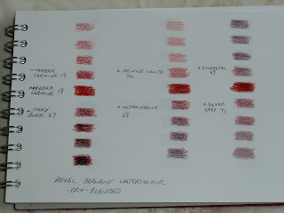
For this exercise I chose a series of colours working a sample in watercolour paints and in watercolour pencils. For each sample I started with the pure colour along the centre line.
I then...
Reduced the amount of colour (top left)
Added black (bottom left)
Added white (centre top)
Added a complementary (centre bottom)
Added a dark grey (right top)
Added a lighter grey (lower right)
My first samples were using madder carmine pencil dry-blended with chinese white, ivory black, ultramarine as the complementary, gunmetal dark grey and silver grey for the light grey.
A similar colour grouping using watercolours - alizarin crimson with ivory black, Chinese white, sap green complementary, grey.
For the second set (same process) I chose Naples yellow and dark violet for the complementary, dry-blended...
...and wet-blended
Set three was grass green pencil and scarlet lake as the complementary. Again, dry-blended...
...and wet-blended
The last set was watercolour using cadmium orange and cerulean blue as the complementary.
There were interesting differences when adding black compared to adding a complementary shade. The complementary is more subtle and tends towards brown. Adding white as opposed to simply using less pigment is also quite different. Of course this wasn't a very scientific experiment as there was no measurement of the various colours used and the proportions, but it was a fun exercise.


