(DISPLAY BOARD PIECE - BOARD 6 OF 10)
For this sample I decided to develop one of the pieces I prepared for the interlude. The collaged images were originally inspired by the word "Bleak" and I assembled a range of yarns and other materials to reflect one of the images. From the collage I created the preparatory yarn wrap.
The resulting piece aims to recreate the image. However, I originally made the wrap assuming following the lower edge working right to left. For this reason, the mounting on the board is arguably upside down!
On reflection, I think the piece works better working left to right across the lower edge, anchoring the heavier, more solid elements at the bottom of the piece. Looking at it afresh, with the wool and plastic at the top it seems top-heavy so I think it should be displayed the other way up. (Interestingly, I wove it following the colours and textures in the image left to right).
Starting with a rough grey Herdwick wool (a hill sheep specially adapted to living in the bleak, harsh conditions in areas such as the North Lakes so very appropriate). This represented the rough, snow-covered ground.
Grey, biodegradable, recycled packaging bags for the fencing.
More wool to anchor the plastic and create more rough, snowy ground, followed by a layer of loosely woven waste synthetic quilt wadding. This made great snow.
A black and grey boucle yarn and a deeper grey wool were woven together using a curved weft to create undulating snowy/gravelly ground. Next I added two rows of Soumak using strips of soft, sheer polyester fabric remnants. A further layer of snowy boucle scrub leads into a final sturdy layer of denser hedgerow.
Thoughts:
My first thought here is about the longevity of the piece. In using a biodegradable plastic I've probably given myself a bit of an issue in the longterm. Next time I'd either use a less environmentally friendly plastic or swap this for a different material, perhaps a grey/black tweed or similar wool-based variegated fabric.
There is some visible hemp warp here but it blends well with the other colours in the piece, giving the impression of rough grass stalks. It also needed to be sturdy to hold the stronger materials such as fabric, plastic and strong wool. A finer warp might have frayed or broken.
The upside-down mounting aside, I really like this piece. The monotone colour scheme creates harmony and the different materials give texture and interest. My piece isn't perhaps quite as bleak as my images but it still works well for me. Using an abstract concept was an interesting thing to interpret as a woven piece.
Action points:
Consider materials used and any specific needs. Using a short-life plastic for a piece that may be expected to have to last a number of years in a display setting, particularly, for example, if mounted outside or in bright sunlight would be potentially disastrous.
Although I had evaluated my yarns and done a yarn wrap, a smaller sample weave or additional wraps would have most likely flagged up the issues with the proportions of the various materials. I need to take more time to sample and resist the urge to get straight into a project.
Tuesday, 19 November 2013
Monday, 18 November 2013
Assignment 4 - Project 9 - Woven Structures - Stage 3 - Part One - Experimenting with Different Materials
(DISPLAY BOARD PIECE - BOARD 5 OF 10)
This second attempt at warping was far more successful - quicker and right first time! Warping correctly gave a little over a metre of continuous warp to work with. I made individual looped heddles made from short lengths of knotted hemp (the warp was also hemp) which took a while but these will be re-usable and it was easier to maintain the tension on the warps than it was when wrapping a single thread around the heddle dowels.
For this piece I worked with a colour range of pinks, purples and greys using wools and a number of more unusual materials, plastic bubble wrap, straws, plastic, fabric and wadding.
Thoughts:
It was fun to work with a variety of materials, however, more attention is required when tensioning the weft. As I left some of the warp open, I would have to consider whether it would be necessary to fix the wefts in place in some way to prevent the wefts sliding out of place.
I have done this by painting the wefts with dilute pva in the past so this is something I might try. The tricky part would be any textured yarns and avoiding flattening or spoiling the textural qualities in the wefts. (Perhaps focussing on fixing on the warps above and below the weft threads?).
The bubble wrap was particularly interesting and refracted the light well. This could be used successfully to add light, reflections or sparkle. Being translucent, of course, care would need to be taken with the colour of the warp. (Is there a translucent fibre that would be strong enough as a warp or are all translucent threads too stretchy?).
The straws were fun but I can't see an immediate use for these as to me they looked too much like, well, straws.
Action points
Warping is a long process and I could have tried a smaller sample on cardboard (as in the earlier exercise) to see how these materials interacted before I committed myself. This could have been a time-consuming mistake in a larger piece.
I think I should also consider whether using unusual materials such as straws really works and not include them just because they are unusual. Having the confidence to go back and re-work or remove parts of a design that doesn't work is something I should be seeking to develop. Again, more sampling would have helped as maybe a different style of weave above and between the straws might have made the design work better.
This second attempt at warping was far more successful - quicker and right first time! Warping correctly gave a little over a metre of continuous warp to work with. I made individual looped heddles made from short lengths of knotted hemp (the warp was also hemp) which took a while but these will be re-usable and it was easier to maintain the tension on the warps than it was when wrapping a single thread around the heddle dowels.
For this piece I worked with a colour range of pinks, purples and greys using wools and a number of more unusual materials, plastic bubble wrap, straws, plastic, fabric and wadding.
Thoughts:
It was fun to work with a variety of materials, however, more attention is required when tensioning the weft. As I left some of the warp open, I would have to consider whether it would be necessary to fix the wefts in place in some way to prevent the wefts sliding out of place.
I have done this by painting the wefts with dilute pva in the past so this is something I might try. The tricky part would be any textured yarns and avoiding flattening or spoiling the textural qualities in the wefts. (Perhaps focussing on fixing on the warps above and below the weft threads?).
The bubble wrap was particularly interesting and refracted the light well. This could be used successfully to add light, reflections or sparkle. Being translucent, of course, care would need to be taken with the colour of the warp. (Is there a translucent fibre that would be strong enough as a warp or are all translucent threads too stretchy?).
The straws were fun but I can't see an immediate use for these as to me they looked too much like, well, straws.
Action points
Warping is a long process and I could have tried a smaller sample on cardboard (as in the earlier exercise) to see how these materials interacted before I committed myself. This could have been a time-consuming mistake in a larger piece.
I think I should also consider whether using unusual materials such as straws really works and not include them just because they are unusual. Having the confidence to go back and re-work or remove parts of a design that doesn't work is something I should be seeking to develop. Again, more sampling would have helped as maybe a different style of weave above and between the straws might have made the design work better.
Assignment 4 - Project 9 - Woven Structures - Stages 1 and 2 - Preparation and Basic Weaving Techniques
(DISPLAY BOARD PIECE - BOARD 5 OF 10)
Warping up
First, a spot the obvious mistake question. Yes, that's right, instead of taking up warps from just one side of the warp bar, I somehow managed to pick alternate warps from either side :-(
After reading and re-reading the warping instructions and watching a number of online tutorials, I realised that I'd warped only half the required number of ends and what should have been a rolling warp of 40 ends was in fact only 20. To make up the desired 40, I was effectively weaving the two warps together.
Fortunately, there was enough movement in the warp as it was to make the first sample piece.
Selecting the yarns
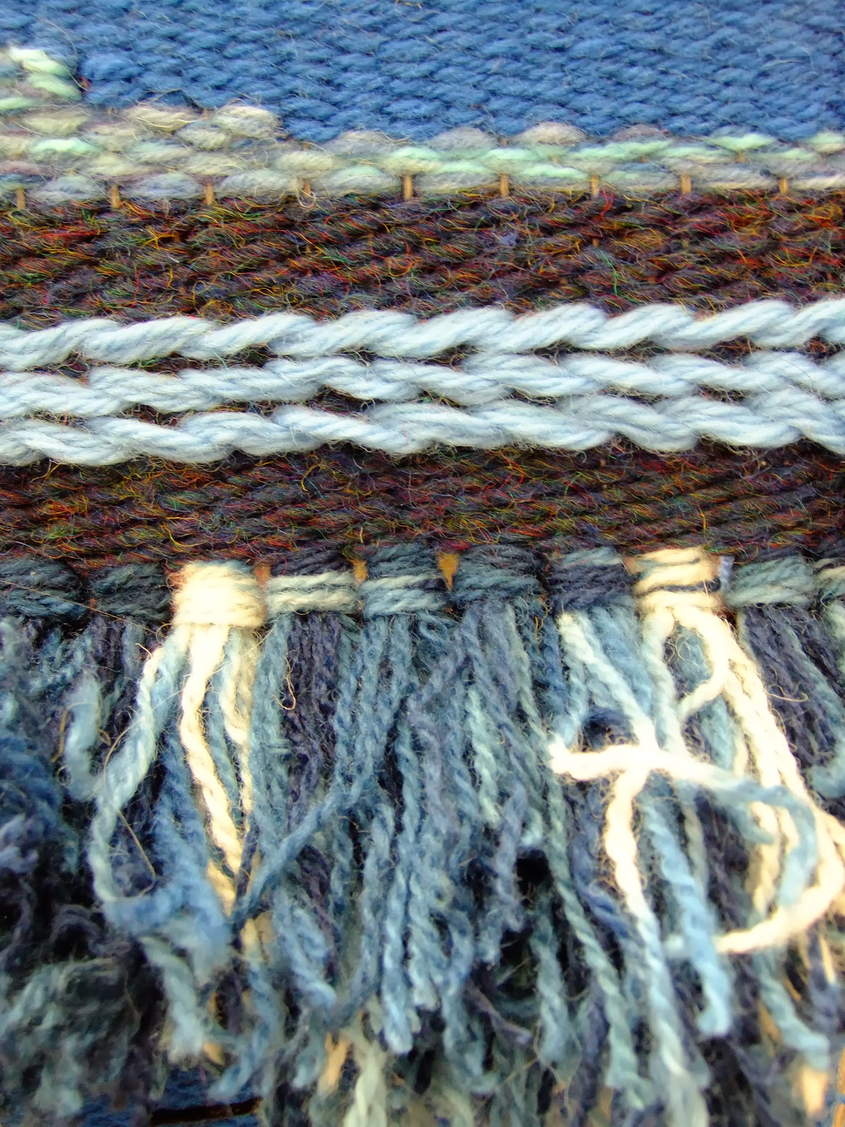
For this I selected yarns, threads and other materials in a range of shades of blue.
Starting to weave
I used a hemp warp and a hemp edging, then wove in plain weave using 2 shades of a basic blue knitting yarn.
I continued with short lengths of naturally indigo and woad dyed wool, making Ghiordes Knots across the warp, using 9 4-ply threads per pair of warps. I worked 2 rows of plain weave, followed by another row of knots.
Several rows of thick wool followed by a row of 3 rows of Soumak, interspersed with 1 row of plain weave. For the Soumak, I worked 2 of the rows weaving right to left, the third row I reversed the direction of the wrapping and worked left to right. Pairing a left with a right direction created an interesting effect, rather like chain stitches.
After several more rows of wool plain weave, I wove a section using curved wefts.
After levelling the warp with several rows of plain weave, I finished the piece.
Before cutting the piece from the warp, I trimmed off the knots to give a satisfyingly dense and fluffy texture.
After cutting the piece off the warp, I knotted the ends in pairs.
Thoughts:
Setting up the warp was complicated and time-consuming (as evidenced by the fundamental error). However, once weaving was underway, it was fascinating to watch the fabric grow and it progressed relatively quickly.
This first piece was purely experimental, however, it was interesting to note that, when viewed from a distance, the fabric had a very landscape feel to it. The lower section was reminiscent of sea with foaming waves (the knots). The Soumak created a horizon line above which the tonal dark blue/brown gave the impression of hills surmounted by clouds and sky.
Action points
Although this piece was not formally planned, it's clear that it would be possible to recreate quite complex and attractive imagery using this technique. It would also be interesting to explore possibilities offered by the knotting process, perhaps making a graduated fabric varying the colours used in each knot across (or up the piece) as it progresses to achieve subtle shading.
Making the curved wefts took a little practice to persuade the pieces to fill in without gaps and also to get the tensioning right.
The hemp warp used was strong and had a certain amount of grip which made the wefts easier to push together. However, for a proper project I would need to consider carefully how to finish off the top and bottom edges. Perhaps binding with fabric? The hemp was too stiff to be readily woven in and wouldn't hold a twisted cord/plait readily. The hemp could have been softened first but this would have potentially made the warp too floppy and difficult to keep tensioned. This is something which needs further research.
Warping up
First, a spot the obvious mistake question. Yes, that's right, instead of taking up warps from just one side of the warp bar, I somehow managed to pick alternate warps from either side :-(
After reading and re-reading the warping instructions and watching a number of online tutorials, I realised that I'd warped only half the required number of ends and what should have been a rolling warp of 40 ends was in fact only 20. To make up the desired 40, I was effectively weaving the two warps together.
Fortunately, there was enough movement in the warp as it was to make the first sample piece.
Selecting the yarns
For this I selected yarns, threads and other materials in a range of shades of blue.
Starting to weave
I used a hemp warp and a hemp edging, then wove in plain weave using 2 shades of a basic blue knitting yarn.
I continued with short lengths of naturally indigo and woad dyed wool, making Ghiordes Knots across the warp, using 9 4-ply threads per pair of warps. I worked 2 rows of plain weave, followed by another row of knots.
Several rows of thick wool followed by a row of 3 rows of Soumak, interspersed with 1 row of plain weave. For the Soumak, I worked 2 of the rows weaving right to left, the third row I reversed the direction of the wrapping and worked left to right. Pairing a left with a right direction created an interesting effect, rather like chain stitches.
After several more rows of wool plain weave, I wove a section using curved wefts.
After levelling the warp with several rows of plain weave, I finished the piece.
Before cutting the piece from the warp, I trimmed off the knots to give a satisfyingly dense and fluffy texture.
After cutting the piece off the warp, I knotted the ends in pairs.
Thoughts:
Setting up the warp was complicated and time-consuming (as evidenced by the fundamental error). However, once weaving was underway, it was fascinating to watch the fabric grow and it progressed relatively quickly.
This first piece was purely experimental, however, it was interesting to note that, when viewed from a distance, the fabric had a very landscape feel to it. The lower section was reminiscent of sea with foaming waves (the knots). The Soumak created a horizon line above which the tonal dark blue/brown gave the impression of hills surmounted by clouds and sky.
Action points
Although this piece was not formally planned, it's clear that it would be possible to recreate quite complex and attractive imagery using this technique. It would also be interesting to explore possibilities offered by the knotting process, perhaps making a graduated fabric varying the colours used in each knot across (or up the piece) as it progresses to achieve subtle shading.
Making the curved wefts took a little practice to persuade the pieces to fill in without gaps and also to get the tensioning right.
The hemp warp used was strong and had a certain amount of grip which made the wefts easier to push together. However, for a proper project I would need to consider carefully how to finish off the top and bottom edges. Perhaps binding with fabric? The hemp was too stiff to be readily woven in and wouldn't hold a twisted cord/plait readily. The hemp could have been softened first but this would have potentially made the warp too floppy and difficult to keep tensioned. This is something which needs further research.
Sunday, 17 November 2013
Assignment 4 - Project 8 - Experimenting with Structures - What Have You Achieved?
Did you enjoy inventing constructed surfaces? Were you surprised at the results? Can you see a connection between your choice of materials and the types of structures you made; for example, regular, irregular, small or large scale? Which samples worked best - can you say why?
I did enjoy creating constructed surfaces. It was interesting to see how two different sheets of paper, for example, when interwoven, would create a much more interesting fabric and how strong images in the original images were altered once woven. What was also interesting was how the pieces looked when viewed from varying distances.
Depending on the nature of the weave, in some cases (the alternating drips for example), looked nothing like the originals close up, but took on an interesting effect from a distance. The eye filled in the "gaps" created by the interwoven sheet and almost restored the original image, albeit somewhat distorted. This would be an important factor in planning any woven structure of this nature, considering and planning with the viewing distance of the observer in mind.
(Original images)
The reverse of some of the woven fabrics was surprising - often more satisfying than the "right side".
("Right side")
("Wrong side")
Working with other materials produced some good, strong textural effects - the contrast between the thick but supple leather and the soft, delicate viscose was exciting and has potential for future development.
I also liked the idea of deconstructing a textile, in this case the hessian, and re-constructing it into a new fabric, yet retaining its overall character. Inspiration for this came in part from the "deserted house" sample I produced in Assignment 3.
(Deserted house)
How accurate were you in matching all the colours in your postcard:
a) With paints?
b) With yarns/other material?
a) I enjoyed the colour-matching exercises and felt that the matching paints to the postcard was a success. It was interesting to see how many colour variants there are within a single image, even one that appears, prima facie, to be a monotone. There are still variations in the blue river and bridge post - not all the blues are blues at all, but some are green-blues, grey-blues, black-blues. I'm keen to continue trying this process with other media, for example, pastel crayons or acrylics.
b) Matching the yarns was harder, mainly due to limitations in my yarn collection, particularly as regards textured yarns. I could either get colour or texture right but not always both! I found working intuitively without any source image was more liberating and allowed me to explore colour and texture in a less constrained way. For a really accurate interpretation of an image I would most likely select appropriate textured yarns/fibres/fabrics in an undyed state and dye these to the colours I need. This worked quite well with the blue bridge postcard where I used my own naturally hand-dyed yarns as there were many subtle variations in the yarns from the dyeing process.
Combining yarns would also be a good way to build the desired colour. When I work with tapestry (sewing) I build up colours using a number of threads of fine crewel wool. This is a successful way of creating tonal variation without jarring colour changes. Presumably I could also combine colours and textures?
I did enjoy creating constructed surfaces. It was interesting to see how two different sheets of paper, for example, when interwoven, would create a much more interesting fabric and how strong images in the original images were altered once woven. What was also interesting was how the pieces looked when viewed from varying distances.
Depending on the nature of the weave, in some cases (the alternating drips for example), looked nothing like the originals close up, but took on an interesting effect from a distance. The eye filled in the "gaps" created by the interwoven sheet and almost restored the original image, albeit somewhat distorted. This would be an important factor in planning any woven structure of this nature, considering and planning with the viewing distance of the observer in mind.
(Original images)
The reverse of some of the woven fabrics was surprising - often more satisfying than the "right side".
("Wrong side")
Working with other materials produced some good, strong textural effects - the contrast between the thick but supple leather and the soft, delicate viscose was exciting and has potential for future development.
I also liked the idea of deconstructing a textile, in this case the hessian, and re-constructing it into a new fabric, yet retaining its overall character. Inspiration for this came in part from the "deserted house" sample I produced in Assignment 3.
(Deserted house)
How accurate were you in matching all the colours in your postcard:
a) With paints?
b) With yarns/other material?
a) I enjoyed the colour-matching exercises and felt that the matching paints to the postcard was a success. It was interesting to see how many colour variants there are within a single image, even one that appears, prima facie, to be a monotone. There are still variations in the blue river and bridge post - not all the blues are blues at all, but some are green-blues, grey-blues, black-blues. I'm keen to continue trying this process with other media, for example, pastel crayons or acrylics.
b) Matching the yarns was harder, mainly due to limitations in my yarn collection, particularly as regards textured yarns. I could either get colour or texture right but not always both! I found working intuitively without any source image was more liberating and allowed me to explore colour and texture in a less constrained way. For a really accurate interpretation of an image I would most likely select appropriate textured yarns/fibres/fabrics in an undyed state and dye these to the colours I need. This worked quite well with the blue bridge postcard where I used my own naturally hand-dyed yarns as there were many subtle variations in the yarns from the dyeing process.
Combining yarns would also be a good way to build the desired colour. When I work with tapestry (sewing) I build up colours using a number of threads of fine crewel wool. This is a successful way of creating tonal variation without jarring colour changes. Presumably I could also combine colours and textures?
Subscribe to:
Posts (Atom)