Thursday, 16 May 2013

Assignment 3 - Project 6 - Stage 3 - Applied Fabric Techniques

This is something of a partial post as I've somehow lost the photos of the final piece of this particular stage!

Nonetheless, here are some of the pieces I do have....

For my initial piece I put together a patchwork of light-coloured fabrics and machine-stitched them into a square.

I overlaid this with a piece of dark brown, openweave hessian and machine-stitched onto it. I had no specific plan in mind when I began stitching other than essentially to practice the techniques.

 However, the sample took on a life of its own and windows started appearing, then a door....

I let the piece develop. I had in mind initially that I was going to cut back the hessian to reveal the fabric below and it struck me that by rough-cutting and slashing the hessian within the stitched shapes this created a piece that evoked the feel of a semi-derelict property - sad, dark and abandoned.

There were smashed windows....


A door flung open to let in the elements...


And holes in the walls....

A sorry sight indeed...
I used a stitch-ripper to "smash" the windows and open the door and pulled threads to create the holes in the walls. I pulled additional threads around the edges of the piece to enhance the raw, unkempt look.


For my next piece I selected a sketch of some brightly coloured sea anemones.

I wanted to recreate the delicate fronds of the anemones, the brightness of the colours and the strong circular patterns. I also wanted to convey the feeling of being in the ocean.

Although not easy to see here, I selected a black wool fabric for the background - something firm to stitch on that would be inobtrusive and allow the brightness of the anemones to pop out.
 I cut lots of fine slivers of fabric for the green fronds and used circles of blue, purple and pink sateens for the centres. To create the illusion of being beneath the waves I overlaid the arrangement with a two-tone voile (rescued from an Easter egg wrapping).

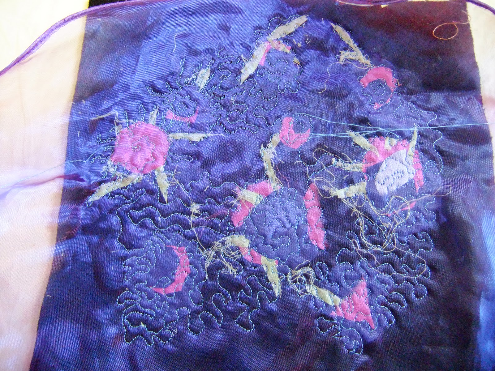
I free-machined over the top of the voile, working in tiny stitches to create a myriad of undulating waves of water.


When the piece was finished I cut back the black wool and shaped the voile to give the piece gently rounded edges rather like an anemone or jellyfish.


Thoughts
I haven't done much free-machine embroidery but my technique did improve. At the beginning there was quite a lot of this...


But with practice the movements became smoother and more fluid and I was able to create much more pleasing shapes....


Interestingly I rather like the reverse of this piece (ignoring the initial mess in the centre). I can see how this would work well either with a plain colour fabric and plain but contrasting thread or perhaps a plain fabric and a variegated or metallic thread. Something to add to the ideas book....

Sunday, 12 May 2013

Assignment 3 - Project 6 - Manipulating Fabric - Developing Ideas - Stages One and Two - Part Two

This part of the project was proving to be a long post so I split it into two. For part two I selected some images and used these as inspiration for collage themes. Some of the images I've used before and I chose these because I had earmarked them as having further potential for development. The manipulated green watercolour, for example, had lots of scope for developing a design that began as a very structured, woven shape, into something more organic and fluid.


The seaweed had such intensely rich colour and shape it was a clear choice for development. I think there is also lots that could be done to develop this image further by exploiting the fabulous texture. It is bookmarked in my sketchbook!


 I chose this computer-collaged series of images to develop the shapes and the bright colours on the black background, exploring postive and negative shapes.


This was an interpretation of part of a piece of knitting from the Kaffe Fassett exhibition, photographed during our OCA study visit. I wanted to create a loose interpretation of the wave forms using simple shapes, allowing the range of colours and textures to be more prominent. 


 This sample was my challenge piece, to see how difficult it would be to develop what is prima facie a very neutral image. On close evaluation, there is much more colour in the image and lots of exciting texture to explore and exploit. Again, I can see potential for this as a textural development piece.


 This image of rice paddies at sunset produced an interesting range of colours but isn't as inspiring as I anticipated. Perhaps I used too many colours and the collage is too busy? The yellow in particular, jars somewhat. Finer swatches and a more delicate approach would have improved this example.


Although I like this collage and the colour and textural combinations, I'm not sure how well the colours reflect the original! I should have suspected as much given my lack of success with extracting the colours into watercolour in an earlier project! On the plus side, I think there is good texture and the shape isn't too disappointing. If I intended to capture the image I needed greater contrast and shadow and perhaps a wider range of deeper-coloured fabrics. A coloured background might also have improved this interpretation.


Saturday, 11 May 2013

Assignment 3 - Project 6 - Manipulating Fabric - Developing Ideas - Stages One and Two - Part One

This exercise involved a lot of digging - collecting up fabrics from all the hiding places in the loft, at the back of cupboards, under the bed (I can say this as I'm pretty sure my hubby doesn't read this blog!). I have to say that I don't like cutting up fabric just for sampling. I'm always worried I won't have enough when I want to use it for a real project!

Nonetheless, I found much more variety and interesting material to work with than I anticipated. These are a few of the fabric collages I made....


I worked with several colour themes, exploring texture, proportion and arrangement . It was interesting to view the collections at actual size but then to see how different aspects emerge when viewed as photographs. The structure of the shapes, both the positive and negative shapes is more apparent when seen as a small image and would, I think, lend itself well to a format for repeating patterns. Texture is naturally best appreciated on a larger scale and in real life, but the variations in reflectivity, tone and saturation are interesting to observe in both the photographic and real forms.


These two samples, for example, share similar shape/layout and proportion of each colour, but changing just one fabric (removing the lilac cotton and replacing with the two-tone blue/purple ruffled voile) has really changed the tone of the collage. I find the first image more pleasing than the second as it is warmer and more harmonious. The second image is okay but for me has a coolness and lack of zing.


By contrast, using the voile as an overlay in this sample brings out its two-tone colouring, the structure of the gauzy fabric and the ripple effect. Pairing it with the sumptuous velvet (top right) adds to the overall effect and being able to see the other fabrics behind the voile gives it a subtle harmony. It also has a freer expression due to the random arrangement of the pieces.


These two sets are also interesting. I like the addition of the burgundy/gold stripe fabric in the top set. It makes the fabrics pop. The lower image is very harmonious but hasn't got much wow factor, despite the gold lame!


I also experimented with neutral colours and this was surprisingly pleasing. This set for me is very open and bright, with interesting textures.


This set, on the other hand, is more "closed", almost introverted. The top image speaks to me of calmness and airiness whereas the second image almost sucks me in like a black hole!

Friday, 10 May 2013

Assignment 3 - Understanding the Textile World - Research point

Assembling a Collection of Fabrics


For this exercise I wanted to take an intuitive approach, allowing myself to select fabrics that I was actively drawn to. I didn't set any goals or specific focus (era/style/fabric type etc.) as I wanted to see what themes or types of fabric appeal to me instinctively without imposition of any boundaries or limitations - a true reflection of my tastes if you like.

Given my love of textiles and fabrics this could have been a very long exercise with enough photos to crash an entire server, so I narrowed it down to my favourites from my selection. There's an album here with more examples and I'll be adding to this to build a library of interesting textiles for future reference.

The selections here are all photographs but some are photographed from my own textile collection - some fabrics in use, others samples from my fabric stash. Some are images pulled from the internet, books or magazines. There are also photographs from exhibitions, museums, textile collections I've visited - so many textiles, so little time!

Sumptuous


So what have I established? I think the word I would use to describe my personal taste in textiles is sumptuous. I am drawn to textiles that are rich in colour, texture, meaning/significance, cultural history, technique and sometimes setting. I particularly love Indian and textiles for their rich colours. Saris are just the most beautiful dresses as they combine texture, swathes of fabric, drape, colour and are so flattering.


Which fabrics dominate, traditional or contemporary?
I would say that neither dominate although there is perhaps a slight bias towards the traditional.

Why is that? Was it to do with availability? The area in which you live? Your own personal interests or tastes?
As my collection is drawn from a wide range of sources, both real and virtual, I didn't feel any particular limitations due to availability or geography. True there are textiles I have found images of that I would very much like to see in person but I had a surprising number of photographs of textiles I have seen (or even own!) that I had forgotten about. In that respect this has been a useful exercise in pulling together lots of "lost" resources. The collection is very much a reflection of my personal taste and I can see it as a valuable future resource.

Which textile techniques dominate your collection?


 I am instinctively drawn to rich colours and textures so there are few pastels or plain coloured fabrics. Traditional stitching, kantha, shisha, shibori, embroidery are all strongly featured but I would extend this to include fabric manufacture that produces interesting textural fabrics - velvets, brocades, complex weave structures. Essentially techniques which create colour (so dyeing and layering for example) or texture (anything from stitching to cut-pile to felting and combinations thereof).


Which fabric do you find most interesting and why?


I particularly like this fabric. It is a hanging, hand-pieced from old saris. I love the fact that the original saris would have been handmade and they have gone on to a second life being further handmade into something so beautiful and decorative. Each piece would no doubt have many stories to tell and they represent for me the lives of the women who wore them, sometimes in day-to-day life, others perhaps for special occasions. They are a piece of living history

I own several such hangings and always have such dilemmas choosing which one to buy!